

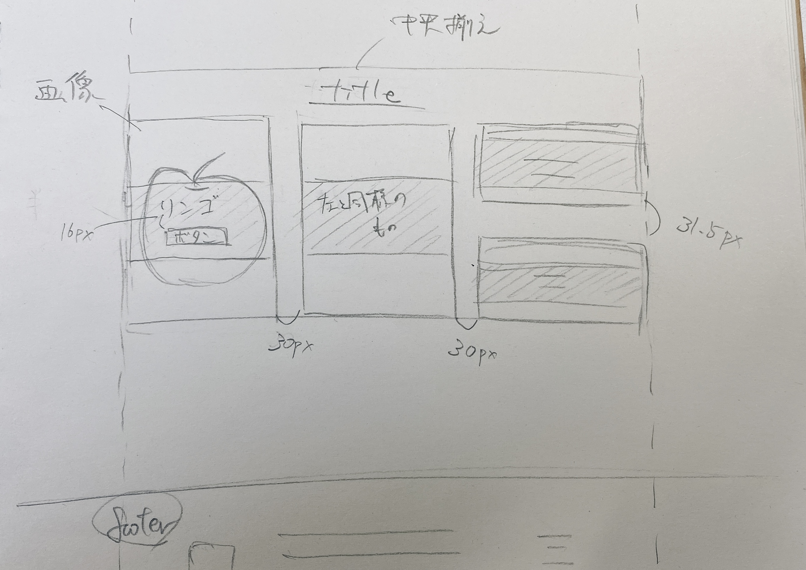
りんごの画像が3つに分割されているのはどう解釈すればよいのでしょうか?
 Q&A
Q&A
shin
総合スコア10
投稿2022/01/21 07:05
flexを用いてコーディングをしているのですが、ネットで検索した通りに作成していますが、上手くいきません。あからさまに可笑しいところもあると思いますが、お助け頂けないでしょうか。
要素等変更して頂いて大丈夫です。
画像の様なものを作成したいです。
html
1 <section> 2 <div class="section-wrapper product"> 3 <div class="section-title"><h2>タイトル</h2></div> 4 5 <div class="wrap"> 6 <div class="box large"> 7 <a href="..."><img src="..."/> 8 <div class="box-text"> 9 <h3 class="white mb-3">りんご1</h3> 10 <span class="simple_square_btn2">ボタン</span> 11 </div> 12 </a> 13 </div> 14 <div class="box large"> 15 <a href="..."/> 16 <div class="box-text"> 17 <h3 class="white mb-3">りんご2</h3> 18 <span class="simple_square_btn2">ボタン</span> 19 </div> 20 </a> 21 </div> 22 <div class="box small"> 23 <a href="...l"><img src="..."/> 24 <div class="box-text"> 25 <h3 class="white mb-3">りんご3</h3> 26 <span class="simple_square_btn2">ボタン</span> 27 </div> 28 </a> 29 </div> 30 <div class="box small"> 31 <a href="...l"><img src="..."/> 32 <div class="box-text"> 33 <h3 class="white mb-3">りんご4</h3> 34 <span class="simple_square_btn2">ボタン</span> 35 </div> 36 </a> 37 </div> 38 </div> 39 </div> 40 </section>
css
1.section-wrapper2{ 2 width: 1146px; 3 height: 620.5px; 4 background: transparent; 5} 6.section-wrap{ 7 display: flex; /* 横並びに */ 8 justify-content: space-between; /* 両端揃え */ 9} 10.box { 11 display: flex; /* 横並びに */ 12 flex-wrap: wrap; /* 折り返し表示できるように */ 13 justify-content: space-between; /* 両端揃え */ 14 flex-basis: 50%; /* 要素の幅指定 */ 15} 16.box a { 17 flex-basis: calc(100% - 20px); /* 要素の幅指定 */ 18 justify-content: center; /* 左右中央揃え */ 19 align-items: center; /* 上下中央揃え */ 20} 21.box.small a { 22 flex-basis: calc(50% - 10px); /* 要素の幅指定 */ 23} 24.box.small a:nth-child(n+3) { 25 margin-top: 20px; 26} 27 28.section-rsample{ 29 width: 1146px; 30 height: 543px; 31 background: transparent; 32} 33 34.box.large{ 35 width: 362px; 36 height: 543px; 37 position: relative; 38/* background: url(...); */ 39} 40 41.box.small{ 42 width: 362px; 43 height: 256.5px; 44 position: relative; 45/* background: url(...); */ 46} 47 48.box a{ 49 text-decoration: none; 50} 51 52.box-text{ 53 position: absolute; 54 background-color: #000000; 55 width: 362px; 56 height: 150px; 57 opacity: 0.8; 58} 59 60.box-text h3{ 61 font-family: "Adobe Garamond Pro"; 62 font-weight: normal; 63 font-size: 36px; 64 letter-spacing: 0.05em; 65 line-height: 58px; 66 text-align: left; 67 color: #fff; 68} 69 70.box-text span{ 71 font-family: "Adobe Garamond Pro"; 72 font-weight: normal; 73 font-size: 14px; 74 line-height: 20px; 75 text-align: left; 76 color: #fff; 77} 78 79.simple_square_btn2 { 80 display: block; 81 position: relative; 82 width: 120px; 83 height: 32px; 84 padding: 0.8em; 85 text-align: center; 86 text-decoration: none; 87 color: #1B1B1B; 88 background: #fff; 89 border:1px solid #1B1B1B; 90}
shin
2022/01/23 05:47
 ベストアンサー


