
実現したいこと
2つのグラフを別々に表示した場合は水平積上げグラフになっているのですが、make_subplotsで連動すると連動はできても積上げグラフになりません。
どうしたら「2つのグラフでⅹ軸が連動した水平積上げグラフ」が作れるのか分かりませんので、ご教示お願い致します。
該当のソースコード
Python
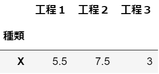
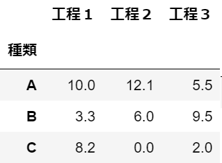
1import pandas as pd 2import plotly.graph_objs as go 3import plotly.io as pio 4from plotly.subplots import make_subplots 5 6df1 = pd.DataFrame(data=(["X",5.5, 7.5, 3],), 7 columns=["種類", "工程1", "工程2", "工程3"] 8 ) 9 10df2 = pd.DataFrame(data=(["A",10, 12.1, 5.5], ["B", 3.3, 6, 9.5], ["C", 8.2, 0 ,2]), 11 columns=["種類", "工程1", "工程2", "工程3"] 12 ) 13 14df1 = df1.set_index('種類') 15df2 = df2.set_index('種類')
df1:
df2:
Python
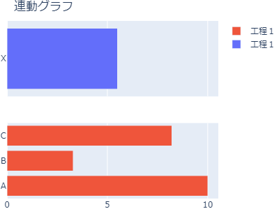
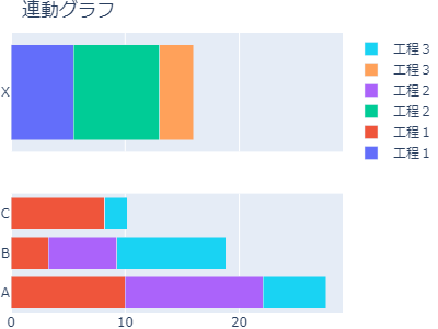
1fig = make_subplots(rows=2, cols=1, shared_xaxes=True) 2 3data1 = [go.Bar(y=df1.index, 4 x=df1.iloc[:, i], 5 name=df1.columns[i], 6 orientation="h" 7 ) 8 for i in range(len(df1.columns))] 9 10 11data2 = [go.Bar(y=df2.index, 12 x=df2.iloc[:, i], 13 name=df2.columns[i], 14 orientation="h") 15 for i in range(len(df2.columns))] 16 17fig.add_trace(data1[0],1,1) 18fig.add_trace(data2[0],2,1) 19 20fig.update_layout(title="連動グラフ", 21 barmode="stack", 22 width=400, height=300, 23 margin=go.layout.Margin(l=0, r=0, b=0, t=30), 24 ) 25fig.show()
積上げグラフにならず、凡例も工程1しか表示されない。
試したこと
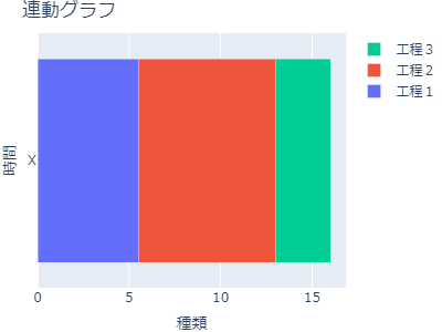
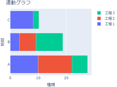
個別で表示した場合は積上げグラフになっています。
Python
1data1 = [go.Bar(y=df1.index, 2 x=df1.iloc[:, i], 3 name=df1.columns[i], 4 orientation="h") 5 for i in range(len(df1.columns))] 6layout = go.Layout( 7 title=go.layout.Title(text="連動グラフ"), 8 xaxis=go.layout.XAxis(title=df1.index.name), 9 yaxis=go.layout.YAxis(title="時間"), 10 barmode="stack", 11 width=400, height=300, 12 margin=go.layout.Margin(l=0, r=0, b=0, t=30), 13 14) 15fig1 = go.Figure(data=data1, layout=layout) 16# fig.update_traces(orientation="h") 17fig1.show() 18 19data2 = [go.Bar(y=df2.index, 20 x=df2.iloc[:, i], 21 name=df2.columns[i], 22 orientation="h") 23 for i in range(len(df2.columns))] 24layout = go.Layout( 25 title=go.layout.Title(text="連動グラフ"), 26 xaxis=go.layout.XAxis(title=df2.index.name), 27 yaxis=go.layout.YAxis(title="時間"), 28 barmode="stack", 29 width=400, height=300, 30 margin=go.layout.Margin(l=0, r=0, b=0, t=30), 31 32) 33fig2 = go.Figure(data=data2, layout=layout) 34# fig.update_traces(orientation="h") 35fig2.show()
以下のようなグラフの状態で連動できるようにしたい。
追加
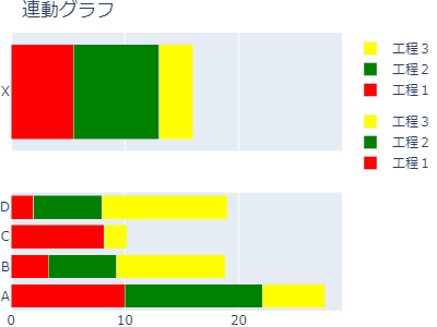
add_traceのところを修正したところ積上げグラフにはなりましたが、
凡例がダブっている。
凡例を工程1,工程2,工程3のようにしたい。
python
1# fig.add_trace(data1[0],1,1) 2# fig.add_trace(data2[0],2,1) 3# 以下のように修正 4for i in range(len(data1)): 5 fig.add_trace(data1[i],1,1) 6 fig.add_trace(data2[i],2,1)
補足情報(FW/ツールのバージョンなど)
python = 3.10.12
pandas = 2.0.3
plotly = 5.9.0
回答1件
あなたの回答
tips
プレビュー


