
質問編集履歴
1
HTMLとCSSの追加、検証画面のスクリーンショットの追加
test
CHANGED
|
File without changes
|
test
CHANGED
|
@@ -33,3 +33,64 @@
|
|
|
33
33
|
}
|
|
34
34
|
}
|
|
35
35
|
}
|
|
36
|
+
|
|
37
|
+
-------------------------------------------------------------------------
|
|
38
|
+
0503追記です。
|
|
39
|
+
|
|
40
|
+
▼html
|
|
41
|
+
```html
|
|
42
|
+
<section class="section">
|
|
43
|
+
<div class="section__txtwrapper">
|
|
44
|
+
<p class="section__subttl">activity</p>
|
|
45
|
+
<h2 class="section__ttl">体験のご案内</h2>
|
|
46
|
+
<p class="section__txt">
|
|
47
|
+
|
|
48
|
+
|文章省略させていただきます。
|
|
49
|
+
|
|
50
|
+
</p>
|
|
51
|
+
<a href="activity.html" class="section__activitylink">詳しくはこちら</a>
|
|
52
|
+
</div>
|
|
53
|
+
<div class="section__img2"></div>
|
|
54
|
+
<div class="section__fluid2"></div>
|
|
55
|
+
</section>
|
|
56
|
+
|
|
57
|
+
```
|
|
58
|
+
|
|
59
|
+
▼CSS
|
|
60
|
+
```css
|
|
61
|
+
&__img2 {
|
|
62
|
+
width: 320px;
|
|
63
|
+
height: 360px;
|
|
64
|
+
background: url(../images/activity_1.png) center center / contain no-repeat;
|
|
65
|
+
position: absolute;
|
|
66
|
+
top: -50%;
|
|
67
|
+
left: 56%;
|
|
68
|
+
|
|
69
|
+
@media screen and (min-width: 600px){
|
|
70
|
+
width: 400px;
|
|
71
|
+
height: 400px;
|
|
72
|
+
top: -40%;
|
|
73
|
+
}
|
|
74
|
+
|
|
75
|
+
@media screen and (min-width: 1025px){
|
|
76
|
+
width: 600px;
|
|
77
|
+
height: 600px;
|
|
78
|
+
left: 50%;
|
|
79
|
+
top: -40%;
|
|
80
|
+
}
|
|
81
|
+
}
|
|
82
|
+
```
|
|
83
|
+
|
|
84
|
+
|
|
85
|
+
|
|
86
|
+
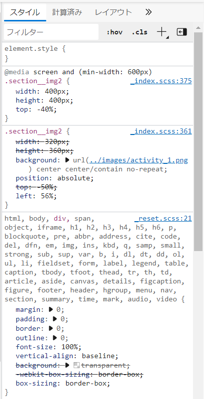
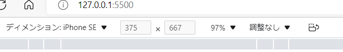
▼検証画面のスクリーンショットです。
|
|
87
|
+
|
|
88
|
+
|
|
89
|
+
|
|
90
|
+
|
|
91
|
+
|
|
92
|
+
検証画面でレスポンシブの確認をする際にこの【ディメンション】のところからiphoneのサイズだったりを選択して確認し作成しています。
|
|
93
|
+
375×667なのにwidth600pxの設定のままなのがなんでなんだろう…と頭がこんがらがっています。
|
|
94
|
+
|
|
95
|
+
分かりづらくすみません(>_<)
|
|
96
|
+
何卒よろしくお願いいたします。
|