


 Q&A
Q&A
flexbox で↓のようなレイアウトについてです
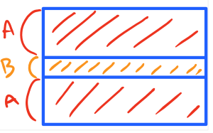
真ん中の高さは不定で要素に応じたサイズ、それ以外を 1:1 に分割します
html
1<style> 2 section{ 3 height: 500px; 4 border: 2px solid lightgreen; 5 display: flex; 6 flex-direction: column; 7 } 8 #top,#bottom{ 9 flex-grow: 1; 10 background: thistle; 11 } 12 .inner{ 13 background: mistyrose; 14 } 15</style> 16 17<section> 18 <div id="top"> 19 <div class="inner">x</div> 20 </div> 21 <div id="middle">=====</div> 22 <div id="bottom"> 23 <div class="inner">y</div> 24 </div> 25</section>
これだと x, y のある .inner の div は #top や #bottom のサイズいっぱいになりません
単純に height:100% をすると、 #top や #bottom のサイズではなくその親の section に対して 100% になります
一応 #top と #bottom も display:flex して .inner を flex-grow:1 することで対処はできます
html
1<style> 2 section{ 3 height: 500px; 4 border: 2px solid lightgreen; 5 display: flex; 6 flex-direction: column; 7 } 8 #top,#bottom{ 9 flex-grow: 1; 10 background: thistle; 11 display: flex; 12 } 13 .inner{ 14 background: mistyrose; 15 flex-grow: 1; 16 } 17</style> 18 19<section> 20 <div id="top"> 21 <div class="inner">x</div> 22 </div> 23 <div id="middle">=====</div> 24 <div id="bottom"> 25 <div class="inner">y</div> 26 </div> 27</section>
ですが、 #top や #bottom を display:flex にせずに .inner を #top や #bottom いっぱいにすることって可能なのでしょうか?
回答1件
 ベストアンサー
あなたの回答
tips
プレビュー


バッドをするには、ログインかつ
こちらの条件を満たす必要があります。
2017/05/17 14:56
2017/05/17 14:57
2017/05/17 15:26
2017/05/17 15:31