
IEはマイクロソフトの開発者が「今後は使うな」的な発言をしていましたが、それでも対応をしていく必要があるものでしょうか?
 Q&A
Q&A
解決済
総合スコア20
投稿2019/02/21 08:01
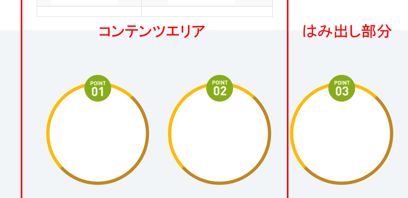
編集2019/02/21 09:41レスポンシブデザインで画像3つの横並びをしたいと思って、flexboxで作っているのですが、
IE11だけ右端に大きくはみ出してしまいます。
いろいろ調べて、考えられるものを.judicialBox__mainに指定しているのですが、どうもうまくいきません。
Google ChromeやEdge、Saffariなどは問題ありません。
html
1 <section class="judicialBox"> 2 <article class="container"> 3 <div class="headBox"> 4 <h3>IE11ではみ出る・・・</h3> 5 </div> 6 <div class="judicialBox__main"> 7 <div class="items"><img src="test01.png" alt=""></div> 8 <div class="items"><img src="test02.png" alt=""></div> 9 <div class="items"><img src="test03.png" alt=""></div> 10 </div> 11 </article> 12 </section>
css
1.judicialBox { 2 padding: 6rem 0; } 3 .judicialBox .headBox { 4 text-align: center; 5 margin-bottom: 4rem; } 6 .judicialBox .headBox h3 { 7 color: #d62264; 8 font-family: "Roboto", sans-serif; 9 margin-bottom: 1rem; } 10 .judicialBox .headBox h3 span { 11 font-size: 4rem; } 12 .judicialBox .headBox p { 13 margin-bottom: 0; 14 font-weight: 600; 15 font-size: 1.7rem; } 16 .judicialBox__main { 17 display: -webkit-flex; 18 display: -webkit-box; 19 display: -moz-flex; 20 display: -moz-box; 21 display: -ms-flex; 22 display: -ms-flexbox; 23 display: -o-flex; 24 display: flex; 25 -ms-flex: 0 1 auto; 26 justify-content: space-between; } 27 .judicialBox__main .items { 28 padding: 0 4rem; }
-ms-flexboxが効かないと、なかなか厳しい感じなのですが、
何かヒントだけでもいただけると幸いです。m(__)m
<補足>
一部画像を加工していますが、スクリーンショットはこんな感じです。
回答1件
あなたの回答
tips
プレビュー
 ベストアンサー


