
コードは外部サービスだけでなく、質問文にコードブロックでお書きください。
 Q&A
Q&A
解決済
総合スコア16
投稿2018/12/21 16:00
編集2018/12/21 16:33##やりたいこと
PCとスマホに対応したレスポンシブデザインのサイトを作りたいと思っています

PCは、このイメージのようなデザインで作成したいと思っています。
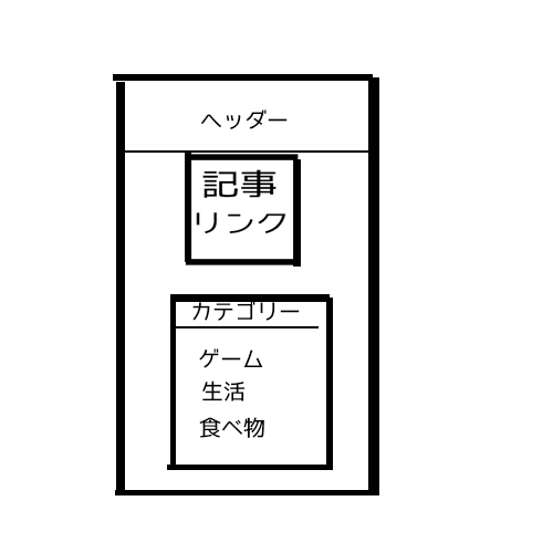
スマートフォンの場合はカテゴリーを記事の下に置きたいと思っています。
記事とカテゴリーは、中央揃えして見栄えをよくしたいです。
##ソースコード
JFiddle
html
1<!DOCTYPE html> 2<html lang="ja"> 3 <head> 4 <meta charset="utf-8"> 5 <meta name="viewport" content="width=device-width,initial-scale=1.0,minium-scale=1.0,user-scalable=no"> 6 <meta name="description" content="abc"> 7 <title>aaa</title> 8 <link rel="stylesheet" href="css/index.css"> 9 <link href="https://fonts.googleapis.com/css?family=Viga" rel="stylesheet"> 10 <link href="https://fonts.googleapis.com/css?family=Roboto+Mono" rel="stylesheet"> 11 <link href="https://fonts.googleapis.com/css?family=B612" rel="stylesheet"> 12 </head> 13 <body> 14 <!--ヘッダー--> 15 <header> 16 <p> 17 <a href="index.html">aaa</a> 18 </p> 19 </header> 20 21 <!--記事--> 22 <div> 23 <div class="main"> 24 <ul class="container"> 25 <li> 26 <img src="img/aaa.png"> 27 <time datetime="2018-12-21">2018年12月21日</time> 28 <dl> 29 <dt>説明</dt> 30 </dl> 31 </li> 32 <li> 33 <img src="img/aaa.png"> 34 <time datetime="2018-12-21">2018年12月21日</time> 35 <dl> 36 <dt>説明</dt> 37 </dl> 38 </li> 39 <li> 40 <img src="img/aaa.png"> 41 <time datetime="2018-12-21">2018年12月21日</time> 42 <dl> 43 <dt>説明</dt> 44 </dl> 45 </li> 46 <li> 47 <img src="img/aaa.png"> 48 <time datetime="2018-12-21">2018年12月21日</time> 49 <dl> 50 <dt>説明</dt> 51 </dl> 52 </li> 53 <li> 54 <img src="img/aaa.png"> 55 <time datetime="2018-12-21">2018年12月21日</time> 56 <dl> 57 <dt>説明</dt> 58 </dl> 59 </li> 60 </ul> 61 </div> 62 63 <div class="side"> 64 <div> 65 <h3>CATEGORY</h3> 66 <ul> 67 <li><a href="#">games</a></li> 68 <li><a href="#">foods</a></li> 69 <li><a href="#">gadgets</a></li> 70 </ul> 71 </div> 72 </div> 73 </div> 74 <!--記事--> 75 </body> 76</html>
css
1/*PC*/ 2body{ 3 margin: 0; 4 padding: 0; 5 background: rgb(234, 237, 242); 6} 7/*ヘッダー*/ 8header{ 9 background: skyblue; 10 width: 100%; 11 height: 50px; 12 display: flex; 13 align-items: center; 14 justify-content: center; 15} 16header p a{ 17 text-decoration: none; 18 color: white; 19 font-size: 190%; 20 font-family: 'Viga', sans-serif; 21} 22/*最新記事*/ 23.container{ 24 display: flex; 25 list-style: none; 26 padding: 0; 27 margin: 0 auto; 28 padding: 0; 29 flex-wrap: wrap; 30 justify-content: center; 31 width: auto; 32} 33.container img{ 34 width: 100%; 35 height: auto; 36 border-top-left-radius: 10px; 37 border-top-right-radius: 10px; 38} 39.container li{ 40 width: 15%; 41 margin: 1%; 42 box-sizing: border-box; 43 padding: 1px; 44 background: white; 45 border-radius: 10px; 46 opacity: 1; 47 transition: opacity 1s; 48} 49.container li:hover{ 50 opacity: 0.5; 51} 52.container li time{ 53 color: #666; 54 font-size: 13px; 55} 56/*float*/ 57.main{ 58 float: left; 59} 60.side{ 61 float: right; 62 background: white; 63 width: 300px; 64 height: 200px; 65 position: relative; 66 right: 50px; 67 bottom: 150px; 68} 69.side ul li{ 70 list-style: none; 71} 72.side ul li a{ 73 text-decoration: none; 74 color: #333; 75} 76.side h3{ 77 background-color: skyblue; 78 margin: 0; 79 padding: 20px; 80 color: white; 81} 82/*レスポンシブ*/ 83@media screen and (min-width:0px) and (max-width:480px) { 84 header{ 85 background: skyblue; 86 width: 100%; 87 height: 100px; 88 display: flex; 89 align-items: center; 90 justify-content: center; 91 } 92 .container li{ 93 width: 80%; 94 margin: 1%; 95 box-sizing: border-box; 96 padding: 1px; 97 background: white; 98 border-radius: 10px; 99 opacity: 1; 100 transition: opacity 1s; 101 } 102 .container li dl dt{ 103 font-size: 90%; 104 } 105 106} 107 108@media screen and (min-width:750px) and (max-width:1000px){ 109 header{ 110 background: skyblue; 111 width: 100%; 112 height: 150px; 113 display: flex; 114 align-items: center; 115 justify-content: center; 116 } 117 .container li{ 118 width: 40%; 119 margin: 1%; 120 box-sizing: border-box; 121 padding: 1px; 122 background: white; 123 border-radius: 10px; 124 opacity: 1; 125 transition: opacity 1s; 126 } 127 .container li dl dt{ 128 font-size: 140%; 129 } 130} 131@media screen and (min-width:1001px) and (max-width:1024px){ 132 header{ 133 background: skyblue; 134 width: 100%; 135 height: 150px; 136 display: flex; 137 align-items: center; 138 justify-content: center; 139 } 140 header p a{ 141 font-size: 300%; 142 } 143 .container li{ 144 width: 40%; 145 margin: 1%; 146 box-sizing: border-box; 147 padding: 1px; 148 background: white; 149 border-radius: 10px; 150 opacity: 1; 151 transition: opacity 1s; 152 } 153 .container li dt{ 154 font-size: 30px; 155 } 156} 157
##やったこと-失敗したこと
float: rightとleft を使ってみたところ、PC用は正常にできたが、スマホ用は下にきたものの中央揃え出来ていなかった。
なのでposition: relativeとtop,bottom,left,right,などを使ってみたがうまくいかず、サイズが変わったときに対応できなかった。
「記事へのリンク」という見出しが、2つの時はカテゴリーと重ならなかったが、2つ以上になるとカテゴリーと重なってしまい希望しているデザインと違った。(PCとスマホ)
margin-left: auto,margin-right: auto,margin-left:0 auto,margin-right:0 auto,など試してみたが上手くいかなかった。
##環境
Google chrome
Atom
回答2件
あなたの回答
tips
プレビュー
 ベストアンサー


