
質問編集画面タイトル横にある「初心者アイコン」をご活用ください。「初心者」と質問で書くよりも伝わりますし、質問一覧に表示されるのでわかりやすくなります。
 Q&A
Q&A
解決済
総合スコア19
投稿2018/05/24 01:39
編集2018/05/24 02:21jQuery初心者です。
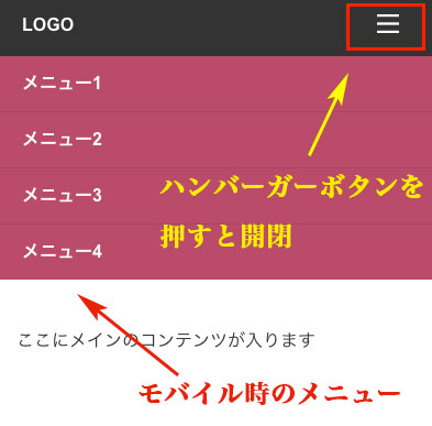
サンプルを見ながらレスポンシブのハンバーガーメニューを作成しようと練習しているのですが、
モバイル時にハンバーガーメニューを開閉後、768px以上の画面で見ると
(例えばタブレットを縦→横にしたときの表示)PC用のメニューが非表示になってしまいます。
ブラウザの「更新」ボタンを押すと、PC用のメニューが表示されるのですが、
どうも不便でコードの追記をどのようにしたら良いかが分かりません。
大変お手数ですが、良い方法がございましたらお教え頂けますと幸いです。

<!-- HTML -->
<!doctype html>
<html>
<head>
<meta charset="UTF-8">
<meta name="viewport" content="width=device-width, minimum-scale=1, maximum-scale=1">
<title>メニューのテスト</title>
<link rel="stylesheet" href="css/reset.css">
<link rel="stylesheet" href="css/style.css">
<script src="https://ajax.googleapis.com/ajax/libs/jquery/2.1.4/jquery.min.js"></script>

<script>
$(function(){
	// アイコンをクリック
	$("button").click(function(){
		// ulメニューを開閉する
		$("ul").slideToggle();
	});
});
</script>

</head>
<body>
<header>
  <h1>LOGO</h1>

<nav>
  <button><img src="img/button.png" width="20" height="17" alt="Button"></button>
  <ul>
    <li><a href="#">メニュー1</a></li>
    <li><a href="#">メニュー2</a></li>
    <li><a href="#">メニュー3</a></li>
    <li><a href="#">メニュー4</a></li>
  </ul>
</nav>
</header>
<main>
  <p>ここにメインのコンテンツが入ります</p>
</main>
</body>
</html>
/* style.css */
@charset "UTF-8";

body{
	font-family:Arial, sans-serif;
	-webkit-font-smoothing:antialiased;
	color:#333;
}

header h1{
	padding:20px 25px;
	color:#FFF;
	background:#333;
	font-weight:bold;
}

/*768px以上の表示
-----------------------------------*/
@media only screen and (min-width:768px) {

header {
    position: relative;
}

button{
    display: none;
}

nav {
    position: absolute;
    top: 20px;
    right: 10px;
    }

nav li {
    display: block;
    width: 100px;
    float: left;
}

nav li a {
    color: #fff;
    text-decoration:none;
}
}
/*768px以上の表示ここまで
-----------------------------------*/


/*767px以下の表示
-----------------------------------*/
@media only screen and (max-width:767px) {

button{
	position:absolute;
	top:17px;
	right:25px;
	background-color:transparent;
	border:none;
	cursor:pointer;
}

button:focus{
	outline:none;
}

ul{
	display:none;
	list-style-type:none;
}

li a{
	text-decoration:none;
	font-weight:bold;
	display:block;
	padding:17px 25px;
	color:#FFF;
	background:#B94B6A;
	border-bottom:1px solid #A24861;
}

li:last-child a{
	border-bottom:none;
}
}
/*767px以下の表示ここまで
-----------------------------------*/

main{
	display:block;
	padding:40px 20px 20px;
	color:#333;
    clear: both;
}

p{
	margin-bottom:50px;
	line-height:2em;
}
/* reset.css */
/* http://meyerweb.com/eric/tools/css/reset/
   v2.0 | 20110126
   License: none (public domain)
*/

html, body, div, span, applet, object, iframe,
h1, h2, h3, h4, h5, h6, p, blockquote, pre,
a, abbr, acronym, address, big, cite, code,
del, dfn, em, img, ins, kbd, q, s, samp,
small, strike, strong, sub, sup, tt, var,
b, u, i, center,
dl, dt, dd, ol, ul, li,
fieldset, form, label, legend,
table, caption, tbody, tfoot, thead, tr, th, td,
article, aside, canvas, details, embed,
figure, figcaption, footer, header, hgroup,
menu, nav, output, ruby, section, summary,
time, mark, audio, video {
	margin: 0;
	padding: 0;
	border: 0;
	font-size: 100%;
	font: inherit;
	vertical-align: baseline;
}
/* HTML5 display-role reset for older browsers */
article, aside, details, figcaption, figure,
footer, header, hgroup, menu, nav, section {
	display: block;
}
body {
	line-height: 1;
}
ol, ul {
	list-style: none;
}
blockquote, q {
	quotes: none;
}
blockquote:before, blockquote:after,
q:before, q:after {
	content: '';
	content: none;
}
table {
	border-collapse: collapse;
	border-spacing: 0;
}
※追記文です。
管理画面の操作に慣れておらず、失礼いたしました。
サンプルは「jQuery標準デザイン講座」という書籍なので、ネットにはおそらく全ての内容は掲載されていないと思います。
http://www.shoeisha.co.jp/book/detail/9784798136226
サンプルのメニューはスマホ用のメニューだけしか掲載されていなかったので、 レスポンシブに対応できれば良いなと思い、編集しているところでした。
よろしくお願いいたします。
回答1件
あなたの回答
tips
プレビュー
 ベストアンサー


