

 Q&A
Q&A
IEの場合はバージョンにより大きく違いが見られることがあります。バージョンも追記してください。
投稿2017/06/16 02:26
編集2018/06/24 06:06サイズ違いで画像を resp1(300x163),resp2(768x419),resp3(1000x546) と用意しまして、ヘッダ画像をレスポンシブ反応させてみました。
chrome は良好でした。
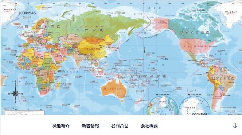
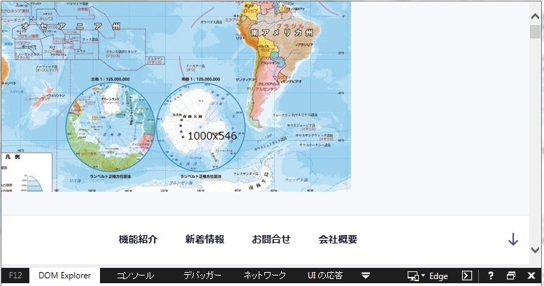
IE(11.0.9600.18697) では、いずれのサイズでも、以下のように、画像の中心が左上に移動されたようになります。世界地図の右下しか見えません。 図中1000x546の文字列は画像として埋め込まれています。
css
1@media screen and (min-width: 769px) { 2 #wp-custom-header .resp1 { 3 display: none; 4 } 5 #wp-custom-header .resp2 { 6 display: none; 7 } 8 #wp-custom-header .resp3 { 9 display: inline; 10 max-width: 100%; 11 height: auto; 12 background-size: contain; 13 } 14}
[htmlの該当箇所]
<!DOCTYPE html>
<html lang="ja" class="no-js no-svg">
<head>
  <meta charset="UTF-8">
  <meta name="viewport" content="width=device-width, initial-scale=1">
  <meta name="generator" content="WordPress 4.7.5" />
    <link rel="stylesheet" href="style.css">
      <title>net -net- net</title>
    <link rel="canonical" href="whatever you want" />
    <link rel='stylesheet' id='twentyseventeen-style-css'  href='whatever you want' type='text/css' media='all' />

    <style type="text/css">
      img.wp-smiley,
      img.emoji {
        display: inline !important;
        border: none !important;
        box-shadow: none !important;
        height: 1em !important;
        width: 1em !important;
        margin: 0 .07em !important;
        vertical-align: -0.1em !important;
        background: none !important;
        padding: 0 !important;
      }
    </style>
    <style type="text/css" id="custom-theme-colors" >
    .resp3 {
      object-fit: cover;
      object-position: center top;
      font-family: 'object-fit: cover; object-position: center top;'
    }

    @media screen and (min-width: 1px) {
      #wp-custom-header .resp1 {
        display: inline;
        max-width: 100%;
        height: auto;
        background-size: contain;
      }
      #wp-custom-header .resp2 {
        display: none;
      }
      #wp-custom-header .resp3 {
        display: none;
      }
    }
    @media screen and (min-width: 301px) {
      #wp-custom-header .resp1 {
        display: none;
      }
      #wp-custom-header .resp2 {
        display: inline;
        max-width: 100%;
        height: auto;
        background-size: contain;
      }
      #wp-custom-header .resp3 {
        display: none;
      }
    }
    @media screen and (min-width: 769px) {
      #wp-custom-header .resp1 {
        display: none;
      }
      #wp-custom-header .resp2 {
        display: none;
      }
      #wp-custom-header .resp3 {
        display: inline;
        max-width: 100%;
        height: auto;
        background-position-x: center;
        /*width 100%;*/
        background-size: contain;
      }
    }

    @media screen and (min-width: 48em) {
      .colors-custom .nav-links .nav-previous .nav-title .icon,
      .colors-custom .nav-links .nav-next .nav-title .icon {
        color: hsl( 230, 50%, 20% ); /* base: #222; */
      }
    }

	</style>
  <style id="twentyseventeen-custom-header-styles" type="text/css">
    .site-title,
    .site-description {
      position: absolute;
      clip: rect(1px, 1px, 1px, 1px);
    }
  </style>
  <style type="text/css" id="wp-custom-css">
    .has-header-image .custom-header-media img{
      position: static;
    }
    .has-header-image.twentyseventeen-front-page .custom-header, .has-header-video.twentyseventeen-front-page .custom-header, .has-header-image.home.blog .custom-header, .has-header-video.home.blog .custom-header {
      height: auto;
    }
    .custom-header-media {
      position: static;
    }
    .custom-header-media:before {
      background: none;
    }
    .page .panel-content .entry-title, .page-title, body.page:not(.twentyseventeen-front-page) .entry-title {
      font-size: 2rem;
    }
    .panel-image {
      background-size: contain;
    }
  </style>

</head>

<body class="home page-template-default page page-id-34 twentyseventeen-front-page has-header-image page-one-column title-tagline-hidden colors-custom">
  <div id="page" class="site">
  	<a class="skip-link screen-reader-text" href="#content">コンテンツへスキップ</a>
  	<header id="masthead" class="site-header" role="banner">
      <div class="custom-header">
      	<div class="custom-header-media">
      		<div id="wp-custom-header" class="wp-custom-header">
            <img src="C:\Users\Owner\Desktop\world map-300x163.jpg" alt="SSS" class="resp1">
            <img src="C:\Users\Owner\Desktop\world map-768x419.jpg" alt="SSS" class="resp2">
            <img src="C:\Users\Owner\Desktop\world map-1000x546.jpg" alt="SSS" class="resp3">
          </div>	</div>

      	  <div class="site-branding">
           <div class="wrap">
        	  <div class="site-branding-text">
        		 <h1 class="site-title">
               <a href="whatever you want" rel="home">net-net-net</a>
             </h1>
          		<p class="site-description">世界中どこでも</p>
          	</div><!-- .site-branding-text -->
        	 </div><!-- .wrap -->
          </div><!-- .site-branding -->
      </div><!-- .custom-header -->

  	<div class="navigation-top">
  		<div class="wrap">
  			<nav id="site-navigation" class="main-navigation" role="navigation" aria-label="トップメニュー">
  	      <button class="menu-toggle" aria-controls="top-menu" aria-expanded="false">
            <svg class="icon icon-bars" aria-hidden="true" role="img"> <use href="#icon-bars" xlink:href="#icon-bars"></use> </svg>
            <svg class="icon icon-close" aria-hidden="true" role="img"> <use href="#icon-close" xlink:href="#icon-close"></use> </svg>メニュー
          </button>
  	      <div class="menu-%e3%83%88%e3%83%83%e3%83%97%e3%83%a1%e3%83%8b%e3%83%a5%e3%83%bc-container">
            <ul id="top-menu" class="menu">
              <li id="menu-item-311" class="menu-item menu-item-type-post_type menu-item-object-page menu-item-home current-menu-item page_item page-item-34 current_page_item menu-item-311">
                <a href="http://sss/">whatever you want</a>
              </li>
              <li id="menu-item-308" class="menu-item menu-item-type-post_type menu-item-object-page menu-item-308">
                <a href="http://sss/sss%e3%82%b3%e3%83%bc%e3%83%ab/">機能紹介</a>
              </li>
              <li id="menu-item-217" class="menu-item menu-item-type-post_type menu-item-object-page menu-item-217">
                <a href="http://sss/whatsnew/">新着情報</a>
              </li>
              <li id="menu-item-71" class="menu-item menu-item-type-post_type menu-item-object-page menu-item-71">
                <a href="http://sss/contact/">お問合せ</a>
              </li>
              <li id="menu-item-216" class="menu-item menu-item-type-post_type menu-item-object-page menu-item-216">
                <a href="http://sss/companys/">会社概要</a>
              </li>
            </ul>
          </div>
  			<a href="#content" class="menu-scroll-down">
          <svg class="icon icon-arrow-right" aria-hidden="true" role="img"> <use href="#icon-arrow-right" xlink:href="#icon-arrow-right"></use> </svg>
          <span class="screen-reader-text">本文までスクロール</span>
        </a>
  	</nav><!-- #site-navigation -->
  				</div><!-- .wrap -->
  			</div><!-- .navigation-top -->

  	</header><!-- #masthead -->

  <script>
    function(){
        objectFitImages('.resp3');
    };
  </script>
</body>
</html>
IE [要素の検査]では、
.custom-header
-.custom-header-media
--::before
--id="wp-custom-header" class="wp-custom-header"
---画像(.resp1 ~ 3)
という構造。
画像(.resp1 ~ 3)のスタイルは上記。
親要素 .custom-header img に対して、
css
1position: static; 2left: 50%; 3min-height: 100%; 4width: auto; 5top: 50%; 6transform: translateX(-50%) translateY(-50%);
となっております。(-ms-translate を記載しているのですが、取り消し線が引かれているので無効と思われます。)
-------
object-fit について、「object-fitとobject-positionをIEやEdgeでも動かす」を読みました。
https://github.com/bfred-it/object-fit-imagesよりダウンロードした ofi.min.js を html, css と同じフォルダに置き、
javascript
1$(function () { 2objectFitImages('.resp3'); 3});
css
1.resp3 { 2object-fit: cover; 3object-position: center top; 4font-family: 'object-fit: cover; object-position: center top;' 5}
としてみましたが変わらずです。
-------
上図chrome のようにIEでも世界地図全面を表示させるにはどのようにすればよろしいでしょうか?
なにがしかご教授いただけますと幸いです。
回答2件
あなたの回答
tips
プレビュー
 ベストアンサー


