
 Q&A
Q&A
現状と問題
サイトのHeader部分を制作しているのですが**<nav class="navbar">**に入っている
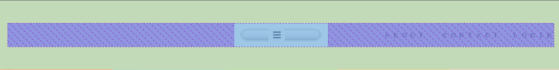
nav-item-imageを下部画像緑色(navvar)の中央に配置したいのですが
navbar-brandとnavbar-navと共存しており、X軸がずれてしまっています。
こちらを参考にしているのですが、こちらのように画像を真ん中に配置したいです。
BootStrapのmx-auto中央に寄せたいのですが、でどのように構造を変えれば良いですか?
**text-align: center;**でも構いません。
CSSでこの部分はいじっていません。

ソースコード
HTML
1<main class="h-100"> 2 <div class="page-wrapper d-flex flex-row h-100 w-100"> 3 <!-- トップバー --> 4 <nav class="navbar px-3 py-5 bg-light border-bottom shadow-sm"> 5 <div class="navbar-brand toggle-menu"> 6 <button class="btn btn-light btn-sm" id="sidebarToggler"> 7 <i class="fas fa-bars fa-lg" id="sidebarTogglerFa"></i> 8 </button> 9 </div> 10 <!-- 中央画像 --> 11 <div class="nav-item-image ml-3 text-muted"> 12 <img src="{{ STATIC_URL }}img/header2.jpg" width="200" height="50" alt="サンプル"> 13 </div> 14 <ul class="navbar-nav d-flex flex-row"> 15 <li class="nav-item-underline ml-3 text-muted"> 16 <a class="p-2 link-secondary" href="#" style="text-decoration:none;">ABOUT</a> 17 </li> 18 <li class="nav-item-underline ml-3 text-muted"> 19 <a class="p-2 link-secondary" href="#" style="text-decoration:none;">CONTACT</a> 20 </li> 21 <li class="nav-item-login mx-3 text-muted"> 22 LOGIN 23 </li> 24 </ul> 25 </nav> 26 <!-- トップバー --> 27 </div> 28</main>
CSS
1a { 2 font-family: "001Shirokuma-Regular"; 3 font-size: large; 4} 5 6.navbar-nav { 7 position: absolute; 8 right: 0px; /* 右からの位置指定 */ 9 top: 50px; 10} 11 12/* <- header-bar icon -> */ 13.nav-item-underline { 14 position: relative; 15 display: inline-block; 16 text-decoration: none; 17 font-size: large; 18} 19 20.nav-item-underline::after { 21 position: absolute; 22 left: 0; 23 content: ""; 24 width: 100%; 25 height: 2px; 26 background: #000000; 27 bottom: 0px; /*アンダーラインが現れ始める位置(aタグの下辺からの高さ)*/ 28 opacity: 0; 29 visibility: hidden; 30 transition: 0.3s; 31} 32 33.nav-item-underline:hover::after { 34 visibility: visible; 35 bottom: -3px; 36 opacity: 1; 37} 38/* <- header-bar icon -> */ 39
変更後
<!-- トップバー -->
<nav class="navbar px-3 py-5 bg-light border-bottom shadow-sm position-static justify-content-center" id="navbar">
    <div class="navbar-brand toggle-menu position-absolute start-0">
        <button class="btn btn-light btn-sm" id="sidebarToggler">
            <i class="fas fa-bars fa-lg" id="sidebarTogglerFa"></i>
        </button>
    </div>

    <!-- 中央画像 -->
    <!-- text-muted mx-auto -->
    <a class="nav-item-image" href="/">
        <img src="{{ STATIC_URL }}img/header2.jpg" class="text-muted" width="200" height="50" alt="サンプル">
    </a>

    <ul class="navbar-nav d-flex flex-row position-absolute end-0">
        <li class="nav-item-underline ml-3 text-muted">
            <a class="p-2 link-secondary" href="#" style="text-decoration:none;">ABOUT</a>
        </li>
        <li class="nav-item-underline ml-3 text-muted">
            <a class="p-2 link-secondary" href="#" style="text-decoration:none;">CONTACT</a>
        </li>
        <li class="nav-item-login mx-3 text-muted">
            LOGIN
        </li>
    </ul>
</nav>
<!-- トップバー -->
.navbar-nav {
	right: 0px; /* 右からの位置指定 */
	/* top: 38%; */
	font-family: "001Shirokuma-Regular";
	font-size: large;
}

.nav-item-image {
	text-align: center;
	/* position: absolute; */
	/* right: 50%; 右からの位置指定 */
	/* top: 50px; */
}

/* <- menu icon -> */
.nav-item-menu {
	position: relative;
	display: inline-block;
	text-decoration: none;
	font-family: "001Shirokuma-Regular";
	font-size: large;
}

.nav-item-menu::after {
	position: absolute;
	left: 17%;
	content: "";
	width: 65%;
	height: 1.5px;
	background: #000000;
	bottom: 10px;
	opacity: 0;
	visibility: hidden;
	transition: 0.3s;
}

.nav-item-menu:hover::after {
	visibility: visible;
	bottom: 5px;
	opacity: 1;
}
回答1件
 ベストアンサー
あなたの回答
tips
プレビュー


2021/10/20 06:22
2021/10/20 06:52
2021/10/28 15:36 編集