


 Q&A
Q&A
前提・実現したいこと
ワードプレス、テーマ「Anima」を使用し、ウェブサイトを作成しています。
表示画面が小さくなった場合やiPhoneから見た場合にレイアウトが崩れてしまいます。
発生している問題・エラーメッセージ
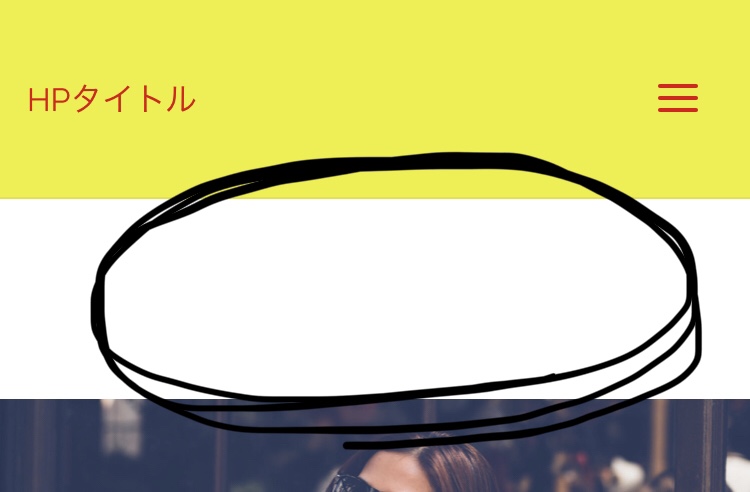
表示画面が小さくなった場合やiPhoneから見た場合に、ヘッダー下(ヘッダーとヘッダー画像の間。添付画像の◯印の部分)に余白ができてしまいます。
この余白をなくすには、CSSをどのように修正(もしくは追加)すればよいでしょうか。
ヘッダー画像のサイズは、テーマ内で推奨されている1920×420ピクセルです。
該当のソースコード
ヘッダー部分のCSSです。
.masthead::after {
display: table;
clear: both;
content: "";
}
.masthead {
position: relative;
}
.branding {
float: left;
-webkit-transition: .5s height ease-in-out;
transition: .5s height ease-in-out;
}
.branding .identity {
float: left;
}
a#logo {
display: inline;
}
a#logo > img {
max-height: 90%;
vertical-align: middle;
}
.site-text {
position: relative;
top: 50%;
display: inline-block;
float: left;
-webkit-transform: translateY(-50%);
-ms-transform: translateY(-50%);
transform: translateY(-50%);
}
.branding .identity + #site-text {
margin-left: 1em;
clear: none;
}
.site-title {
float: left;
position: relative;
display: inline-block;
line-height: 1.4;
-webkit-transition: .35s ease-out all;
-ms-transition: .35s ease-out all;
transition: .35s ease-out all;
}
.site-title a span {
display: inline-block;
}
.site-title:hover::before {
width: 100%;
}
.site-description {
display: none;
clear: left;
float: left;
margin-top: 3px;
font-size: .9em;
line-height: 1.2;
opacity: .75;
}
.site-header-main {
display: inline-block;
top: 0;
z-index: 101;
width: 100%;
margin: 0 auto;
vertical-align: top;
border-bottom: 1px solid transparent;
-webkit-transition: all .2s linear;
transition: all .2s linear;
}
.anima-over-menu #site-header-main {
position: absolute;
}
/* transparent background rule moved to responsiveness */
.site-header-main-inside {
position: relative;
display: block; /table/
width: 100%;
}
.header-fixed#site-header-main,
.header-fixed#site-header-main #access::after {
box-shadow: 0 0 3px rgba(0,0,0,0.2);
-webkit-transition: .25s background-color ease-in-out;
transition: .25s background-color ease-in-out;
}
.header-image-main,
.header-image-main-inside {
position: relative;
overflow: hidden;
}
.anima-cropped-headerimage div.header-image {
height: 100%;
}
.anima-responsive-headerimage #masthead div.header-image {
display: none;
}
.anima-cropped-headerimage #masthead img.header-image {
display: none;
}
.masthead .header-image {
display: block;
width: inherit;
max-width: 100%;
margin: 0 auto;
background-size: cover;
background-position: 50% 50%;
background-attachment: fixed;
}
.wp-custom-header {
position: relative;
line-height: 0;
}
.wp-custom-header-video-button.wp-custom-header-video-button {
position: absolute;
left: 0;
right: 0;
bottom: 0;
margin: auto;
background: rgba(255,255,255,.1);
opacity: 0;
cursor: pointer;
-webkit-transition: .3s all ease-out;
transition: .3s all ease-out;
}
.wp-custom-header:hover .wp-custom-header-video-button.wp-custom-header-video-button {
opacity: .7;
}
.wp-custom-header video {
object-fit: cover;
max-width: 100%;
}
/* Header widget area */
.header-widget-area {
display: block;
position: absolute;
overflow: hidden;
height: 100%;
top: 10px;
z-index: 99;
}
*/
試したこと
ヘッダー部分CSSの全てのmargin を0にして試してみたのですが、効果がありませんでした。
補足情報(FW/ツールのバージョンなど)
初心者のため、検討違いの質問でしたら申し訳ありません。
よろしくお願いいたします。
回答1件
 ベストアンサー
あなたの回答
tips
プレビュー


バッドをするには、ログインかつ
こちらの条件を満たす必要があります。
2019/01/22 14:19