

 Q&A
Q&A
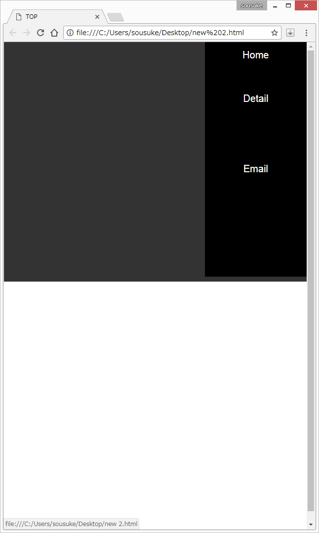
メディアクエリが反映されず形くずれして表示されます。
http://www.webopixel.net/javascript/1060.html
を参考にしながらブラウザが640px以下になったらハンバーガーメニューが出てきて、そこからHome・Detail・Emailが出て来るサイトを作りたいです。
top.htmlに
<head>
    <meta charset="UTF-8">
    <link rel="stylesheet" href="https://maxcdn.bootstrapcdn.com/bootstrap/3.3.7/css/bootstrap.min.css">
    <link rel="stylesheet" href="home.css">
    <script src="https://oss.maxcdn.com/respond/1.4.2/respond.min.js"></script>
    <script src="https://code.jquery.com/jquery-1.11.0.min.js"></script>
    <link rel="stylesheet" href="top.css">
  <script src="hamburger.js"></script>
    <title>TOP</title>
</head>

<body>
    <div>
        <div  id="page-container">
        <nav class="menu" id="top-head">
            <header>
                <div id="mobile-head">
                    <h1>TOP PAGE</h1>

                    <div id="nav-toggle">
                        <div>
                            <span></span>
                            <span></span>
                            <span></span>
                        </div>
                    </div>

                </div>
            </header>
            <nav id="global-nav">
            <ul class="sidebar-ul" id="menu">
                <li>
                    <a class="home" href="home.html">Home</a>
                </li>
                <li>
                    <a class="detail" href="detail.html">Detail</a>
                </li>
            </ul>
            <ul id="social">
                <li>
                    <a class="contact" href="">Email</a>
                </li>
            </ul>
            </nav>
        </nav>
        </div>

        <main>
           <img src="top.png" alt="Arch">
        </main>

    </div>
</body>
と書き、
top.cssに
body,
html {
    margin: 0;
    height: 100%;
}

#page-container {
    display: grid;
    grid-template-columns: 300px 1fr;
    grid-template-areas: "NAV MAIN";
    height: 100%;
}

nav {
    grid-area: NAV;
    background-color: black;
    height: 100%;
    float: left;
    display: grid;
    grid-template-rows: 160px 1fr 1fr 120px;
    grid-template-areas: "HEADER" "MENU" "SOCIAL";
}

main {
    grid-area: MAIN;
}

header {
    grid-area: HEADER;
}

header h1 {
    color: white;
    text-align: center;
    font-size: 28px;
    margin-top: 40px;
}

header h2 {
    color: white;
    text-align: center;
    font-size: 24px;
    margin-top: 3px;
    margin-bottom: 40px;
}

#menu {
    grid-area: MENU;
    display: flex;
    flex-direction: column;
    justify-content: center;
    padding-left: 0px;
}

#menu>li {
    margin: 10px 10px;
    padding: 2px 0px;
}

#menu>li:hover>a {
    color: white;
    text-decoration: none;
}

#social {
    grid-area: SOCIAL;
    display: flex;
    flex-direction: column;
    justify-content: center;
    padding-left: 0px;
}

#social>li {
    margin: 10px 10px;
    padding: 2px 0px;
}

#social>li:hover>a {
    color: white;
    text-decoration: none;
}

#carousel-container {
    width: 100%;
    height: 100%;
}

li {
    list-style: none;
}

li a {
    display: block;
    text-decoration: none;
    color: white;
    text-align: center;
    font-size: 20px;
}

.icon_head {
    padding-right: 10px;
}


@media screen and (max-width: 640px) {
    #top-head
    {
        width: 100%;
        padding: 0;
    }
    #top-head {
        top: 0;
        position: fixed;
        margin-top: 0;
    }
    #top-head.fixed {
        padding-top: 0;
        background: transparent;
    }
    #mobile-head {
        background: white;
        width: 100%;
        height: 56px;
        z-index: 999;
        position: relative;
    }
    #top-head.fixed .logo,
    #top-head .logo {
        position: absolute;
        left: 13px;
        top: 13px;
        color: black;
        font-size: 26px;
    }
    #top-head {
        position: absolute;
        top: -500px;
        background: #333;
        width: 100%;
        text-align: center;
        padding: 10px 0;
        -webkit-transition: .5s ease-in-out;
        -moz-transition: .5s ease-in-out;
        transition: .5s ease-in-out;
    }
    #global-nav ul {
        list-style: none;
        position: static;
        right: 0;
        bottom: 0;
        font-size: 14px;
    }
    #global-nav ul li {
        float: none;
        position: static;
    }
    #top-head #global-nav ul li a,
    #top-head.fixed #global-nav ul li a {
        width: 100%;
        display: block;
        color: #fff;
        padding: 18px 0;
    }
    #nav-toggle {
        display: block;
    }

    .open #nav-toggle span:nth-child(1) {
        top: 11px;
        -webkit-transform: rotate(315deg);
        -moz-transform: rotate(315deg);
        transform: rotate(315deg);
    }
    .open #nav-toggle span:nth-child(2) {
        width: 0;
        left: 50%;
    }
    .open #nav-toggle span:nth-child(3) {
        top: 11px;
        -webkit-transform: rotate(-315deg);
        -moz-transform: rotate(-315deg);
        transform: rotate(-315deg);
    }
    .open #global-nav {
        -moz-transform: translateY(556px);
        -webkit-transform: translateY(556px);
        transform: translateY(556px);
    }
}
と書き、
hamburger.jsに
<script>
(function($) {
    $(function() {
        var $header = $('#top-head');

        $(window).scroll(function() {
            if ($(window).scrollTop() > 350) {
                $header.addClass('fixed');
            } else {
                $header.removeClass('fixed');
            }
        });

        $('#nav-toggle').click(function(){
            $header.toggleClass('open');
        });
    });
})(jQuery);
</script>
と書きました。これらを実行すると、
形ぐずれしたサイトが表示され、ブラウザの幅を小さくしてもハンバーガーメニューは表示されません。
URLと構成を真似て作っているのでなぜうまくいかないのかわかりません。
どう直せば良いのでしょうか?
理想のアウトプットは、
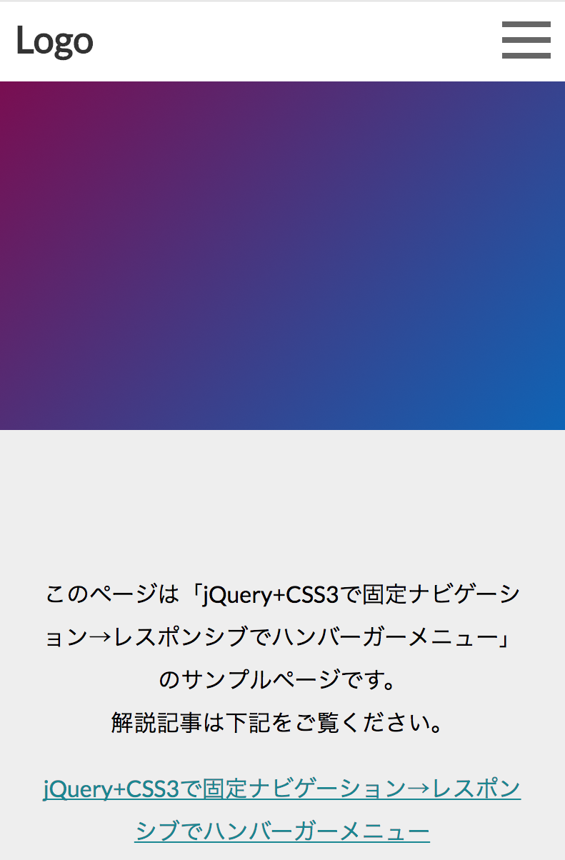
の左上のハンバーガーメニューをブラウザの幅が小さくなったら表示させることです。
回答1件
 ベストアンサー
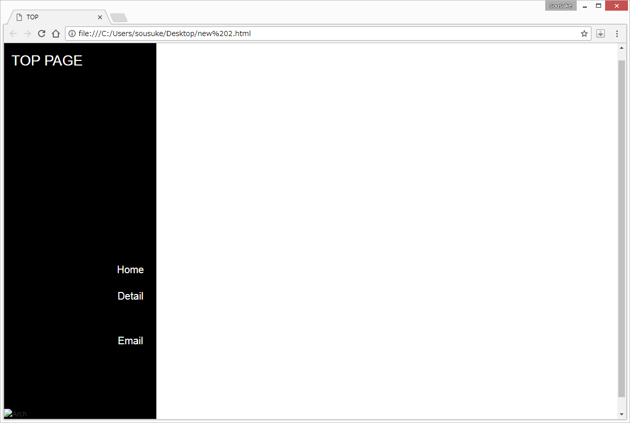
あなたの回答
tips
プレビュー


バッドをするには、ログインかつ
こちらの条件を満たす必要があります。
退会済みユーザー
2018/01/03 07:21
退会済みユーザー
2018/01/03 08:00
2018/01/03 08:12
退会済みユーザー
2018/01/03 08:26