

 ベストアンサー
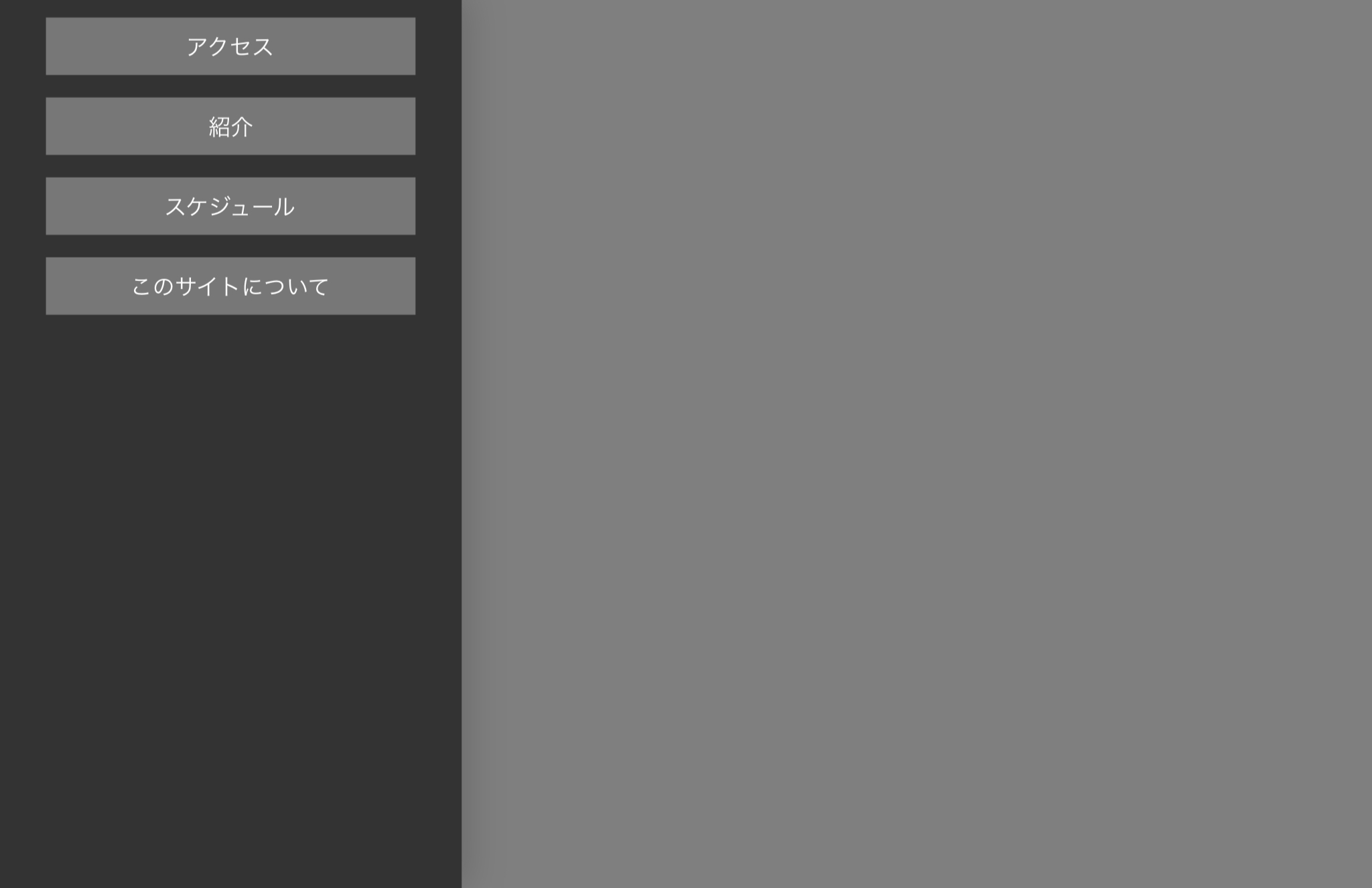
本来ここに書くんじゃないんですけど...
えっと、質問者さんにご提示頂いたコードの中に
/*中身*/
#nav-content {
〜〜〜〜〜〜〜〜
〜〜〜省略〜〜〜
〜〜〜〜〜〜〜〜
background: #fff;/*背景色*/
〜〜〜〜〜〜〜〜
〜〜〜省略〜〜〜
〜〜〜〜〜〜〜〜
}
というのがあるはずです。
そこに#fffを#333系に変更して方がいいよって話です
 Q&A
Q&A
解決済
退会済みユーザー
総合スコア0
投稿2019/08/15 13:10
ハンバーガーメニューで、動きの部分は完成したのですが、メニューの際、味気のない感じのメニューになってしまいました。そこで、背景色をつけたり、スマホで、メニューを押した際に、色が変わるようなやり方を教えて欲しいです。
html
1<header> 2 <div id="nav-drawer"> 3 <input id="nav-input" type="checkbox" class="nav-unshown"> 4 <label id="nav-open" for="nav-input"><span></span></label> 5 <label class="nav-unshown" id="nav-close" for="nav-input"></label> 6 <div id="nav-content"> 7 <a href="ev_access.html">アクセス</a><br> 8 <a href="ev_school.html">紹介</a><br> 9 <a href="ev_exp.html">スケジュール</a><br> 10 <a href="#">このサイトについて</a> 11 </div> 12 13</header>
css
1 .title01 { 2 color: #364e96;/*文字色*/ 3 padding: 0.5em 0;/*上下の余白*/ 4 border-top: solid 3px #364e96;/*上線*/ 5 border-bottom: solid 3px #364e96;/*下線*/ 6 } 7 8 .img_logo{ 9 max-width: 100%; 10 height: 0 auto; 11 width: 0 auto; 12 text-align: center; 13 } 14 15 header { 16 padding:10px; 17 /*background: skyblue;*/ 18 } 19 20 #nav-drawer { 21 position: relative; 22 } 23 24 /*チェックボックス等は非表示に*/ 25 .nav-unshown { 26 display:none; 27 } 28 29 /*アイコンのスペース*/ 30 #nav-open { 31 display: inline-block; 32 width: 30px; 33 height: 22px; 34 vertical-align: middle; 35 } 36 37 /*ハンバーガーアイコンをCSSだけで表現*/ 38 #nav-open span, #nav-open span:before, #nav-open span:after { 39 position: absolute; 40 height: 3px;/*線の太さ*/ 41 width: 25px;/*長さ*/ 42 border-radius: 3px; 43 background: #555; 44 display: block; 45 content: ''; 46 cursor: pointer; 47 } 48 #nav-open span:before { 49 bottom: -8px; 50 } 51 #nav-open span:after { 52 bottom: -16px; 53 } 54 55 /*閉じる用の薄黒カバー*/ 56 #nav-close { 57 display: none;/*はじめは隠しておく*/ 58 position: fixed; 59 z-index: 99; 60 top: 0;/*全体に広がるように*/ 61 left: 0; 62 width: 100%; 63 height: 100%; 64 background: black; 65 opacity: 0; 66 transition: .3s ease-in-out; 67 } 68 69 /*中身*/ 70 #nav-content { 71 overflow: auto; 72 position: fixed; 73 top: 0; 74 left: 0; 75 z-index: 9999;/*最前面に*/ 76 width: 90%;/*右側に隙間を作る(閉じるカバーを表示)*/ 77 max-width: 330px;/*最大幅(調整してください)*/ 78 height: 100%; 79 background: #fff;/*背景色*/ 80 transition: .3s ease-in-out;/*滑らかに表示*/ 81 -webkit-transform: translateX(-105%); 82 transform: translateX(-105%);/*左に隠しておく*/ 83 } 84 85 /*チェックが入ったらもろもろ表示*/ 86 #nav-input:checked ~ #nav-close { 87 display: block;/*カバーを表示*/ 88 opacity: .5; 89 } 90 91 #nav-input:checked ~ #nav-content { 92 -webkit-transform: translateX(0%); 93 transform: translateX(0%);/*中身を表示(右へスライド)*/ 94 box-shadow: 6px 0 25px rgba(0,0,0,.15); 95 }
回答2件
あなたの回答
tips
プレビュー


バッドをするには、ログインかつ
こちらの条件を満たす必要があります。