

 Q&A
Q&A
bootstrap3で、768px未満のナビメニューの表示において、
日付入力部分を横並びにしたいですが、どのような方法が考えられるでしょうか。
▼ナビメニュー768px未満の表示
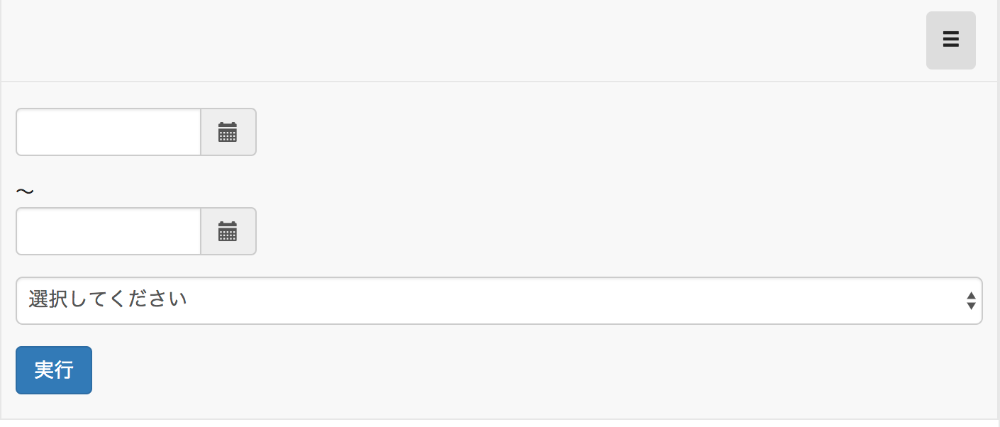
※↑日付部分が縦にスタックされていますが、日付部分は横に並べたいです。
PCでは、以下の様な表示をしています。
▼ナビメニュー768px以上の表示

ソースは以下になります。
html
1<nav class="navbar navbar-default"> 2 <div class="container-fluid"> 3 <div class="navbar-header"> 4 <button type="button" class="navbar-toggle collapsed" data-toggle="collapse" data-target="#smNavMenu"> 5 <span class="sr-only">Toggle navigation</span> 6 <span class="add-on glyphicon glyphicon-menu-hamburger"></span> 7 </button> 8 <a class="navbar-brand" href="#"><img src="'imgs/logo-a.png'" height="25px"/></a> 9 <a class="navbar-brand" href="#"><img src="'imgs/logo-b.png'" height="25px"/></a> 10 </div> 11 <div class="navbar-collapse collapse" id="smNavMenu"> 12 <ul class="nav navbar-nav navbar-right"> 13 <li> 14 <apex:form styleClass="form-inline"> 15 <div class="form-group" style="width: 170px;"> 16 <div class="input-group date"> 17 <input class="form-control" type="text"/> 18 <span class="input-group-addon"><span class="add-on glyphicon glyphicon-calendar"></span></span> 19 </div> 20 </div> 21 <span>〜</span> 22 <div class="form-group" style="width: 170px; margin-right: 1em;"> 23 <div class="input-group date"> 24 <input class="form-control" type="text"/> 25 <span class="input-group-addon"><span class="add-on glyphicon glyphicon-calendar"></span></span> 26 </div> 27 </div> 28 29 <select size="1" class="form-control" style="margin-right: 1em;"> 30 <option value=""/> 31 </select> 32 <button class="btn btn-primary" value="実行"/> 33 <button class="btn btn-info btn-sm invisible" type="button" id="load">件数<span class="badge">26</span></button> 34 </apex:form> 35 </li> 36 </ul> 37 </div> 38 </div> 39 </nav>
cssは、bootstrap3.3.4に、以下cssで上書きしています。
css
1/***************************** 2 Bootstrap 3 *****************************/ 4.bootstrapCustom h1, 5.bootstrapCustom .h1 { 6 font-size: 18px; 7} 8.bootstrapCustom h2, 9.bootstrapCustom .h2 { 10 font-size: 14px; 11} 12.bootstrapCustom h3, 13.bootstrapCustom .h3 { 14 font-size: 14px; 15} 16.bootstrapCustom h4, 17.bootstrapCustom .h4 { 18 font-size: 14px; 19} 20.bootstrapCustom h5, 21.bootstrapCustom .h5 { 22 font-size: 14px; 23} 24.bootstrapCustom h6, 25.bootstrapCustom .h6 { 26 font-size: 14px; 27} 28 29 30.bootstrapCustom h1, 31.bootstrapCustom .h1, 32.bootstrapCustom h2, 33.bootstrapCustom .h2, 34.bootstrapCustom h3, 35.bootstrapCustom .h3 { 36 display: block; 37 margin-top: 10px; 38 margin-bottom: 20px; 39} 40 41.bootstrapCustom .nav-tabs > li.active > a, 42.bootstrapCustom .nav-tabs > li.active > a:hover, 43.bootstrapCustom .nav-tabs > li.active > a:focus { 44 color: #fff; 45 font-weight: bold; 46 background-color: #48b618; 47} 48 49.bootstrapCustom a { 50 color: #48b618; 51 font-weight: bold; 52} 53 54.bootstrapCustom select[multiple], 55.bootstrapCustom select[size] { 56 height: 34px; 57} 58 59.bootstrapCustom .page-header { 60 margin: 15px 0; 61} 62 63.bootstrapCustom .btn-xs, 64.bootstrapCustom .btn-group-xs > .btn { 65 margin-top: -5px; 66} 67 68 69@media (min-width: 768px) { 70 .nav-tabs { 71 display: flex; 72 } 73 74 .nav-tabs li { 75 flex: 1; 76 } 77 78 .nav-tabs a { 79 display: flex; 80 height: 100%; 81 } 82} 83 84.form-inline { 85 margin: 10px 0 !important; 86} 87 88@media (max-width: 767px) { 89 .form-inline { 90 margin: 10px !important; 91 } 92 93 .form-inline > .btn { 94 margin-top: 15px; 95 } 96}
回答1件
 ベストアンサー
あなたの回答
tips
プレビュー


バッドをするには、ログインかつ
こちらの条件を満たす必要があります。