

 Q&A
Q&A
模写コーディングの勉強をしています。
センター 中央 部分のセクションは flex で aligin-items:center の指定をしたら、
中央によったのですが、
最後のフッターのカラムだけ、 中央にきますが、
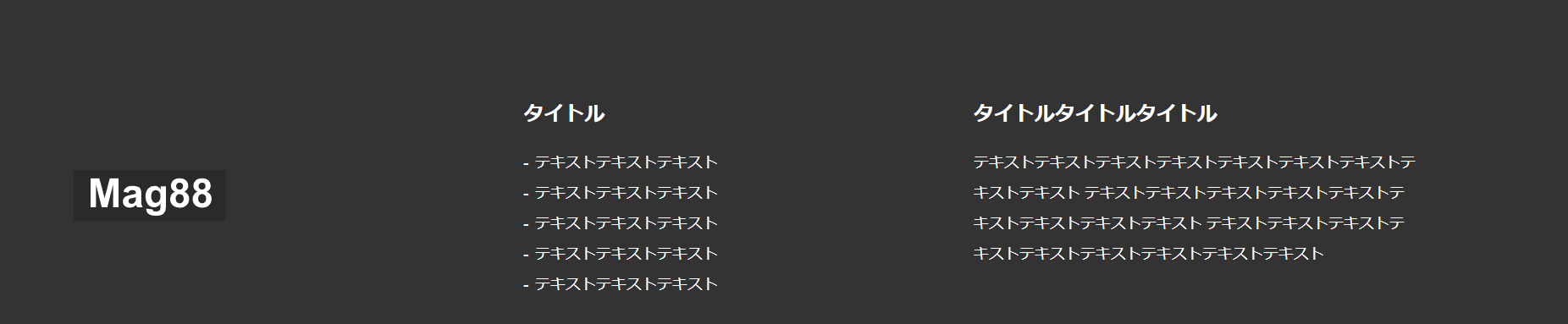
中央の要素
<h2 class="section-title">タイトル</h2> と書かれている部分と
一番右の要素
<h2 class="section-title">タイトルタイトルタイトル </h2>と書かれている部分の 高さが同じにならずにずれてしまいます。
どうすれば高さが揃うようになるのでしょうか?
上記のようにしたいです。
下記がコードのURLです。
 <footer id="footer" class="wrapper">
 <div class="flex-container space-between">
   <div class="footer-box logo">
    <div class="site-title"><img src="/images/logo.svg" alt="Mag88"></div><!-- /.site-title -->
   </div><!-- /.footer-box -->

    <div class="footer-box middle">
     <h2 class="section-title">タイトル</h2><!-- /.section-title -->
       <ul>

        <li>テキストテキストテキスト</li>

        <li>テキストテキストテキスト</li>

        <li>テキストテキストテキスト</li>
                </ul>
        </div><!-- /.footer-box -->
        <div class="footer-box right">
          <h2 class="section-title">タイトルタイトルタイトル
         </h2><!-- /.section-title -->
            <p class="section-text">テキストテキストテキストテキストテキストテキストテキストテキストテキスト テキストテキストテキストテキストテキストテキストテキストテキストテキスト テキストテキストテキストテキストテキストテキストテキストテキストテキスト</p>
             </div><!-- /.footer-box -->
       </div><!--flex-container space-between-->


   </footer><!-- /#footer -->
@charset "UTF-8";

html {
  font-size: 100%;
}
body {
  font-family:"Arial","Hiragino Sans", "Hiragino Kaku Gothiic ProN",
  "Meiryo",sans-serif;
  color: #2a2a2a;
  font-size: 0.875rem;    /*16px*/
}
ul{
  list-style:none;
}
img {
  max-width: 100%;
  vertical-align:bottom;
}
.wrapper{
  max-width:1200px;
  margin:0 auto;
  padding:0 5%;
}

.section-title{
  font-size:1.5rem;  /*24rem*/
  font-weight:bold;
  text-align:center;
  margin-bottom:20px;
}
.head-text{
  width:590px;
  margin:0 auto;

}
.section-text{
font-family: Meiryo;
font-weight: normal;
font-size: 0.875rem;
text-align: center;
color: #24292e;
margin-bottom:40px;


}

.flex-container{
  display:flex;
  align-items:center;

}


.mb-40{
  margin-bottom:40px;
}
.btn{
width: 133px;
height: 44px;
line-height:44px;
background: transparent;
border:1px solid #2A2A2A;
text-align:center;
margin:0 auto;
display:block;
cursor:pointer;
}
a:hover{
  opacity:0.7;
  cursor:pointer;
}
.btn:hover{
  opacity:0.7;
}
.bg-gray{
  background-color: #f8f8f8;
  ;
}

/*-------------------------------------------
ヘッダー
-------------------------------------------*/
#header{
  margin-bottom:80px;
}
/*
h1タグ
line-height にh1タグの高さよりも小さい値「1px」を指定することで、
h1タグの上下の余白が消えるため、ロゴ画像の高さと揃う
「line-height: 0;」を指定してもOKです
*/
#header .site-title{
  width:120px;
  line-height:1px;
  }
/* aタグのリンク範囲を親要素のサイズに広げる */
#header.site-title a{
  display:block;
}
/*-------------------------------------------
Mainvisual
-------------------------------------------*/
#mainvisual{
  width:100%;
  height:auto;
  margin-bottom:80px;
}
h1 img{
  position:absolute;
  margin:30px;
  top:0;
  right:0;

}
/*-------------------------------------------
magazine
-------------------------------------------*/
#magazine{
  background-color:#fff;
  margin-bottom:80px;
}

.flex-container .archive-image,
.flex-container .new-image{
  position:relative;
  max-width:510px;
  margin-right:20px;

}

.flex-container img:last-child{
  margin-right:0;
}


.mask{
 position:absolute;
 top:50%;
 left:50%;
 transform:translate(-50%,-50%);
background-color:rgba(0,0,0,0.7);
color:#fff;
}
.mask h3{
font-family: Arial;
font-weight: bold;
font-size: 20px;
text-align: center;
color: #fff;

}
.mask p{
  font-family: Meiryo;
font-weight: normal;
font-size: 14px;
text-align: center;
color: #fff;

}
/*-------------------------------------------
fashion
-------------------------------------------*/
#fashion{
  height:520px;
  min-width:100%;
  background-image: url(/images/fashion.jpg);
  background-repeat: no-repeat;
  background-position:center center;
  background-size:cover;
  margin-bottom:80px;

}
/*-------------------------------------------
catalog-antique
-------------------------------------------*/
#catalog-antique{
  margin-top: 60px;
  margin-bottom: 120px;
}


.flex-container .text-item{
  width:510px;
   padding:35px;
  margin:150px 0 100px;

}

.flex-container .img-item{
  width:510px;
}
.text-item p{
  font-family: Meiryo;
  font-weight: normal;
  font-size: 0.875rem;
  text-align: left;
  color: #24292e;
  margin-bottom:30px;
   }
.text-item p:last-child{
  margin-bottom:0px;
}


/*-------------------------------------------
footer
-------------------------------------------*/
#footer{
  background:#333;
   padding:100px 183px 123px;
  }
#footer p{
  font-family: Arial;
font-weight: bold;
font-size: 16px;
text-align: left;
color: #fff;

}
#footer .section-title{
  color:#fff;
  font-size:1rem; /*16px*/
}
#footer .section-text{
  font-family: Meiryo;
font-weight: normal;
font-size: 12px;
line-height: 24px;
text-align: left;
color: #fff;

}
#footer .footer-box ul li{
  color:#fff;
  font-size:12px;
}

.footer-box{
  width:33%;
  margin-right:220px;
}

.logo{
  width:120px;
}


.middle{
  width:154px;
}

.right{
  width:336px;
  margin-right:0;
}


.space-between{
  justify-content:space-between;
}

.footer-foot{
  background-color:#fff;
    width:1200px;
    padding:0 5%;
  margin:0 auto;
  text-align:center;
}
.footer-foot small{
  text-align:center;
  font-size:12px;
  line-height:58px;
  color:#24292e;

}
/*-------------------------------------------
SP
-------------------------------------------*/
@media screen and (max-width: 1024px) {
  .inner {
    padding: 0 40px;
  }
  /*-------------------------------------------
  ヘッダー
  -------------------------------------------*/
 #header{
   padding:0 10px;
 }
 /*-------------------------------------------
  Detail
  -------------------------------------------*/
  #detail .content{
    flex-direction:column;

  }
  #detail .content img{
    width:100%;
    margin:0 0 25px 0;
  }
下記がお手本のサイトです
回答1件
 ベストアンサー
あなたの回答
tips
プレビュー


バッドをするには、ログインかつ
こちらの条件を満たす必要があります。
2022/01/21 11:09 編集
2022/01/22 03:29