

 Q&A
Q&A
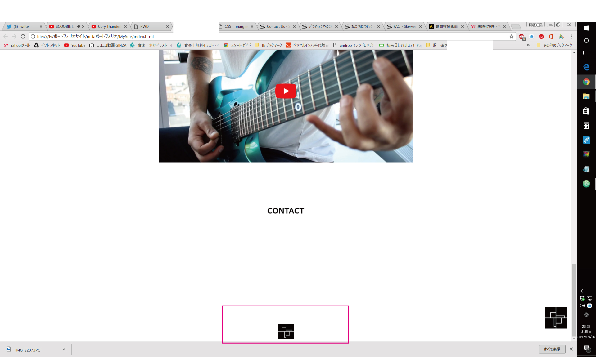
スミマセン質問の意味を今一つ理解しておりませんが、赤枠が現状のフッターの大きさなのでしょうか?これを小さくしたいって事でしょうか?
投稿2017/09/07 14:25
画像のように画像を配置したいのですがうまくいきません。
画像のサイトは自分が一度作ったものでCSSやHTMLは同じにしたはずなのですが大きくなってしまい適切に配置ができません。
ご教授お願いいたします。
<!DOCTYPE html>
<html lang="ja">
<head>
  <meta charset="utf-8">
  <meta name="viewport" content="width=device-width, initial-scale=1.0"><!-- baneではなくname -->
  <link rel="stylesheet" href="https://maxcdn.bootstrapcdn.com/font-awesome/4.7.0/css/font-awesome.min.css">
  <link rel="stylesheet" href="https://cdn.jsdelivr.net/jquery.meanmenu/2.0.6/meanmenu.min.css">
  <link rel="stylesheet" href="css/font-awesome.min.css">
  <!--インストールしたfontawesomeを読み込む-->
  <link rel="stylesheet" href="css/styles.css">
  <!--作ったCSSを読み込む-->
  <meta bane="viewport" content="width=device-width, initial-scale=1.0">
  <!--スマホで開いたとき度の幅で描画するかの設定-->

  <title>RWD</title>
</head>

<body>
<header>

  <div class="container">
  <!--  <i class="fa fa-bars mobile-menu" aria-hidden="true"></i>-->
    <ul class="pc-menu">
      <li>Menu</li>
      <li>Menu</li>
      <li>Menu</li>
    </ul>
    <h1 class="aburasoba">油そば池袋</h1>
  </div>

  <section class="features"><!--section1-->
    <h2>Features</h2>
    <div class="item">
      <img src="img/feature.jpg">
      <p class="right-side">hello. hello. hello. hello. hello. hello. hello.
        hello. hello. hello. hello. hello. hello. hello. hello. hello. </p>
    </div>

    <div class="item">
      <img src="img/feature.jpg">
      <p class="left-side">hello. hello. hello. hello. hello. hello. hello.
        hello. hello. hello. hello. hello. hello. hello. hello. hello. </p>
    </div>

    <div class="item">
      <img src="img/feature.jpg">
      <p class="right-sidet">hello. hello. hello. hello. hello. hello. hello.
        hello. hello. hello. hello. hello. hello. hello. hello. hello. </p>
    </div>
  </section>
</header>
  <script src="https://code.jquery.com/jquery-3.2.1.min.js"></script>
  <script src="https://cdn.jsdelivr.net/jquery.meanmenu/2.0.6/jquery.meanmenu.js"></script>
  <script>
      $(function () {
          $("div.container").meanmenu({});
      });
  </script>

  <footer>
        <p>油そば池袋</p>
    <div class="sita">
        <img src="img/footer.png">
    </div>
  </footer>

</body>


</html>
/*1----------------------------------------------------------------------------------*/
@charset "utf-8";
/*common*/

body{/*初期設定、余計なmargin,paddingを0に*/
font-size: 14px;
font-family: Verdana, sans-serif;
margin: 0;
padding: 0;
color: #333;
background: #F2F2F2;
/*初期設定*/
}
p{/*行間がゆったりする*/
line-height: 2;
}


.container{/*ここで90%の意味はmysiteという上の文字や写真、写真のコメントなどをかこんでいて
  左右に一定の空きができる*/
  width: 90%;
  margin: 0 auto;
}

/*header-mobile-menuはアイコン右寄せ*/
.mobile-menu{
float: right;
font-size: 24px;
cursor: pointer;
}

.pc-menu{
display: none;
}

.pc-menu{
display: block;/*要素の表示形式をしていするっぽい、ブロック要素を表示,,*/
/*46行目にheader-pc-menuを見えない設定をして、ここで820px以上いくとここで表示させる*/
list-style: none;
padding: 10px;
margin: 0;
/*余計なマージンパディング取る、*/
float: right;/*mysiteも入っているheader-pc-menuの中に右にする設定*/
}

.pc-menu > li {
display: inline-block;/*横にする設定*/
width: 60px;
text-align: center;
cursor: pointer;
}

/*sita*/

.sita {
  display: block;/*横にする設定*/
  width: 50px;
  height: 50px;
margin: 0px auto;
  cursor: pointer;
}


/*レスポンシブルデザイン設定①*/
/*幅の大きさが変わる設定*/
/*画面が570px以下になったとき*/
@media (max-width: 414px){
  .pc-menu{/*アイコンを消す*/
  display: none;
  }
  .aburasoba{/*アイコンを消す*/
  display: none;
  }
.features p{
    width: 45%;
}
.features img{
    width: 50%;
}
/*.pull-right*/
.right-side{
    float: right;
    padding-left: 5%;
}
/*.pull-left*/
.left-side{
    float: left;
    padding-right: 5%;
}
.features .item{/*float:leftやrightを使ったので*/
    overflow: hidden;
}
.news .container{
    display: flex;
    justify-content: space-between;/*均等に余白が空く設定*/
}
.news .item{/*newsに入っている画像と文字に対して30%*/
    width: 30%;
}
.news .item img{/*画像が30%だとちゃんと見えないので画像だけ100%に*/
    width: 100%;
}
}
/*画面が570px以上になったとき
min-widthが〇〇以上、max-widthが〇〇までという認識*/
@media (min-width: 414px){
.container{
    width: 414px;
}
.mobile-menu{/*アイコンを消す*/
display: none;
}
}
/*1----------------------------------------------------------------------------------*/

section{/*共通のスタイル、上下にサイズがほしい*/
  padding: 60px 0;
}

section h2{/*文字を中央ぞろえ、下にマージン空き*/
  text-align: center;
}

section:nth-child(even){/*背景色の切り替え*/
  background: #fff;
}

/*features*/
.features img{/*親要素音containerに対して100%の設定なので左右ぴったりになった*/
  width: 100%;
}

.features .item{/*写真と文字を囲っているfeaturesの下の空き*/
  margin-bottom: 60px;
  margin-left: 60px;
  margin-right: 60px;
}

.features .item:last-child{/*これにだけ指定という意味*/
  margin-bottom: 0;
}

.news .item:last-child{/*これにだけ指定という意味*/
  margin-bottom: 0;
}

/*footer*/

footer {
    text-align: center;
    padding: 10px 0;
}
回答1件
あなたの回答
tips
プレビュー
 ベストアンサー


