

 Q&A
Q&A
ご自身で試されたコードを質問文に追記し、「何」が「どのように」わからないのか、コードのどの部分で詰まっているのかなどを具体的に追記されたほうが回答が望めると思います。
投稿2017/08/03 14:40
編集2017/08/03 22:15(2017-08-04 07:14修正)
初めて質問させていただきます。
###前提・実現したいこと
現在、Webデザインの勉強中で
HTML, CSSを用いたレイアウトに苦戦しています。
PC用のデザインで下の図のような
デザインをしようとしています。
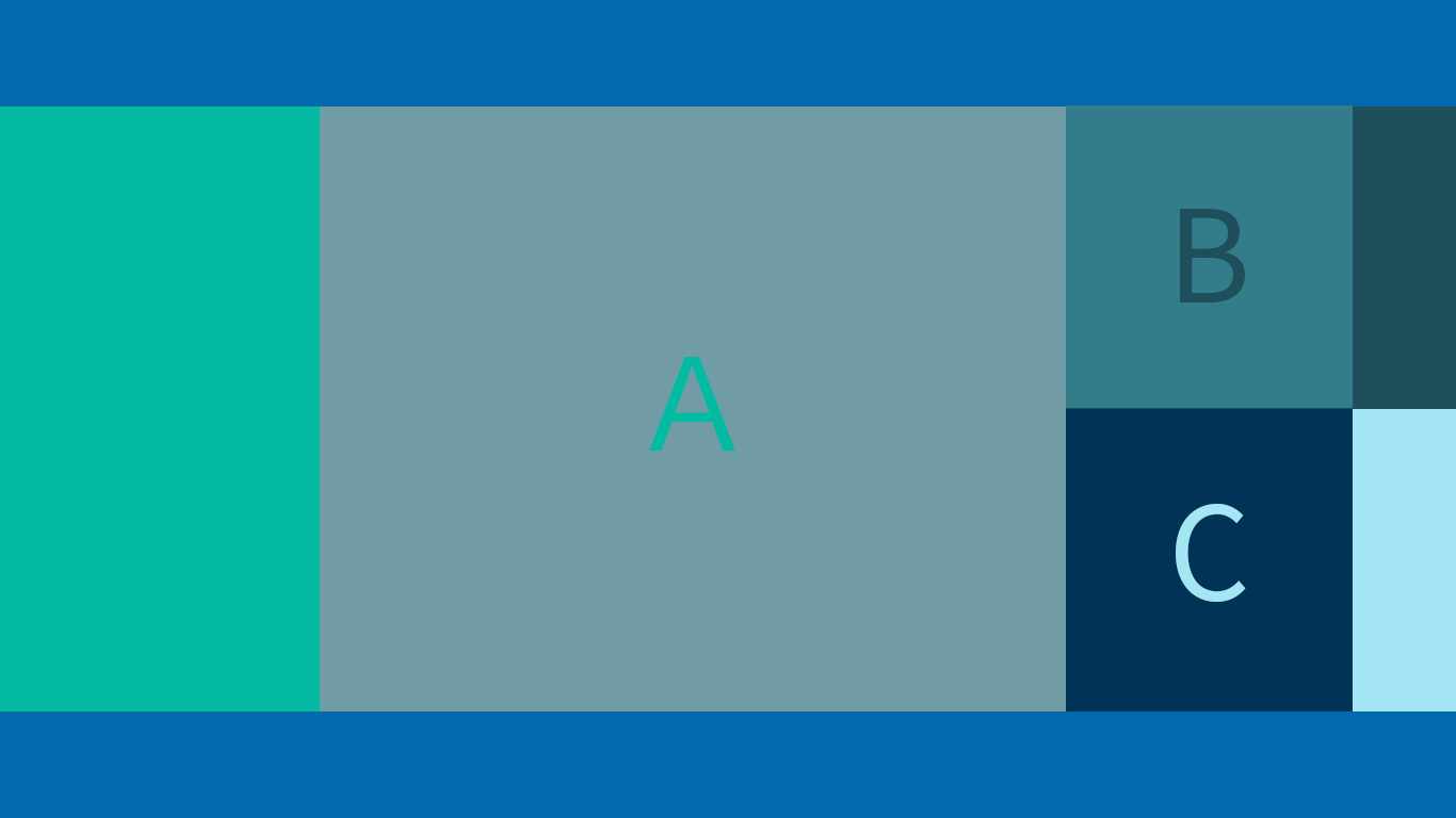
A,B,Cは固定幅で画面の横幅が伸びたときも
A,B,Cは固定幅のまま画面中央部に配置し、
他の背景だけが伸びるようにしたい場合、
どのように組めば最適でしょうか。

###試したこと
floatで試みたり、
flex-boxで試みたりしていますが、
組み方とCSSのあて方が悪いようでうまくいきません。
今はセマンティックを無視するような
力技で組んでいますが、
もっと分かりやすく
管理しやすい構成にしたいです。
html
1<html> 2<body> 3 <header></header> 4 <main class="clearfix"> 5 <div class="A"></div> 6 <div class="BandC"> 7 <div class="B"></div> 8 <div class="C"></div> 9 </div> 10 </main> 11 <footer></footer> 12 <style> 13 header, 14 footer { 15 position: relative; 16 width: 100%; 17 height: 50px; 18 background: #0468AD; 19 } 20 21 main { 22 width: 1000px; 23 margin: 0 auto; 24 } 25 26 .clearfix::after { 27 content: ""; 28 display: block; 29 clear: both; 30 } 31 32 .A { 33 float: left; 34 width: 600px; 35 height: 400px; 36 background: #719BA5; 37 } 38 39 .BandC { 40 float: right; 41 width: 400px; 42 } 43 44 .B, 45 .C { 46 width: 100%; 47 height: 200px; 48 } 49 50 .B { 51 background: #337D8B; 52 } 53 54 .C { 55 background: #013356; 56 } 57 58 header::before { 59 position: absolute; 60 display: block; 61 content: ""; 62 background: #05BAA3; 63 width: calc(50% + 100px); 64 height: 400px; 65 top: 50px; 66 left: 0; 67 z-index: -10; 68 } 69 70 header::after { 71 position: absolute; 72 display: block; 73 content: ""; 74 background: #1E4F5B; 75 width: calc(50% - 100px); 76 height: 200px; 77 top: 50px; 78 right: 0; 79 z-index: -10; 80 } 81 82 footer::before { 83 position: absolute; 84 display: block; 85 content: ""; 86 background: #A4E6F3; 87 width: calc(50% - 100px); 88 height: 200px; 89 bottom: 50px; 90 right: 0; 91 z-index: -10; 92 } 93 </style> 94</body> 95</html>
###補足情報(言語/FW/ツール等のバージョンなど)
Chrome, Safari, Firefoxは最新版、
IEは10以上の環境で見られるようにと想定しています。
回答1件
あなたの回答
tips
プレビュー
 ベストアンサー


