

 Q&A
Q&A
skeletonを利用してコーディングしています。
現在画像のようにマージンが取られている画像を、

このようにしたい
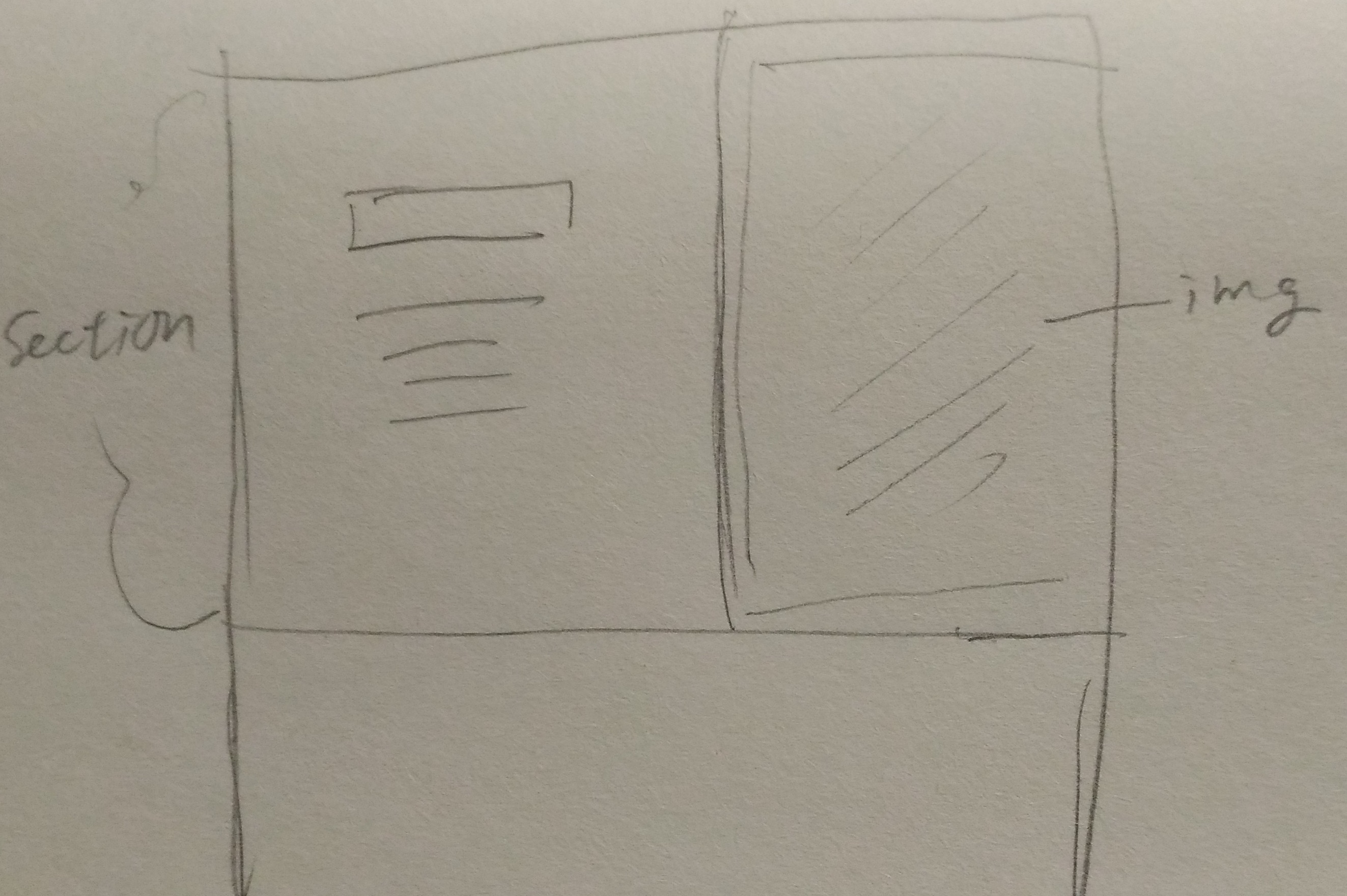
該当箇所では、
rowで横並びにした「コンテンツと画像」があり、右側の画像を画面端に表示させたいです。
ブラウザサイズを1370pxあたりより小さくすると、右側に画像がはみ出てしまい、
逆に1370pxよあたりより大きくすると、最初の画像のようにマージンが右側に取られてしまいます。
メディアクエリでskeletonで用意されている1000以上設定しているのですが、、、
どなたかお分かりになりますでしょうか?
...

  <div class="section position">
    <div class="container">
      <div class="row">
        <div class="six columns busposi-left-contents">
          <div class="busposi-headding">見出し</div>
          <p class="busposi-contents">テキストテキストテキストテキストテキストテキストテキストテキストテキストテキストテキストテキストテキストテキストテキストテキストテキストテキストテキストテキストテキストテキストテキストテキストテキストテキストテキストテキストテキストテキストテキストテキストテキストテキストテキストテキストテキストテキストテキストテキストテキストテキストテキストテキストテキストテキストテキストテキスト</p>
        </div>
        <div class="six columns big-phone">
          <img class="big-phone" src="images/right_big_iphone.png">
        </div>
      </div>
    </div>
  </div>
...
css
1 2/* Sections 3–––––––––––––––––––––––––––––––––––––––––––––––––– */ 4.section { 5 text-align: center; 6} 7 8 9/* Top 10–––––––––––––––––––––––––––––––––––––––––––––––––– */ 11.top { 12 background-image: url('../images/top-catch.png'); 13 background-repeat: no-repeat; 14 background-size: cover; 15 width: 100%; 16 height: 100%; 17 padding: 8rem 0 7rem; 18} 19 20/* Intro 21–––––––––––––––––––––––––––––––––––––––––––––––––– */ 22.intro { 23 background-color: #25C7AD; 24 height: 70vh; 25} 26.intro.column { 27 margin:auto; 28} 29 30 31 32 33/* Bigger than 1000 */ 34@media (min-width: 1000px) { 35 /*Top */ 36 .top-headding { 37 margin-top:56px; 38 font-size:55px; 39 font-weight: 700; 40 color: #25C7AD; 41 } 42 .below-contents { 43 margin-top:72px 44 } 45 .phone { 46 max-height: 784px; 47 } 48 .qr { 49 margin-top: -8px; 50 max-height: 100px; 51 } 52 .top-subcopy { 53 font-size:18px; 54 font-weight: bold; 55 color: #25C7AD; 56 } 57 .top-sumaho { 58 font-size:24px; 59 font-weight: bold; 60 color:#FF7575; 61 } 62 /*Intro */ 63 .intro-headding { 64 margin-top:56px; 65 font-size:55px; 66 font-weight: 700; 67 } 68 .intro-contents { 69 margin-top:64px; 70 } 71 72 .busposi-headding { 73 margin-top:56px; 74 font-size:55px; 75 font-weight: 700; 76 } 77 .busposi-contents { 78 margin-top:64px; 79 } 80 .big-phone { 81 max-height:100vh; 82 } 83 84 85} 86
補足
検証ツールでみたところ
container が960pxで定義されているようで、それが関係あるかもしれません。
skeleton.css
ここらへんいじってmax100%とかにしてみたんですが、container 960pxで変わりませんでした。
css
1... 2container { 3 position: relative; 4 width: 100%; 5 max-width: 960px; 6 margin: 0 auto; 7 padding: 0 20px; 8 box-sizing: border-box; } 9.column, 10.columns { 11 width: 100%; 12 float: left; 13 box-sizing: border-box; } 14 15/* For devices larger than 400px */ 16@media (min-width: 400px) { 17 .container { 18 width: 85%; 19 padding: 0; } 20} 21 22/* For devices larger than 550px */ 23@media (min-width: 550px) { 24 .container { 25 width: 80%; } 26 .column, 27 .columns { 28 margin-left: 4%; } 29 .column:first-child, 30 .columns:first-child { 31 margin-left: 0; } 32...


バッドをするには、ログインかつ
こちらの条件を満たす必要があります。
2016/08/17 03:14
2016/08/17 05:18