

 Q&A
Q&A
【環境】
OS:Windows7
ブラウザ:Chrome
Bootstrap3
Bootstrapを適用してフォームを作成しています。
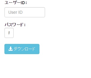
テキスト欄とパスワード欄で幅を揃えたいのですが、Bootstrap3が推奨する公式のdivクラスで指定すると幅が揃いません。
下記のようになり、パスワード欄はレスポンシブな動きにもなっていないようです。
styleでwidthを指定してしまえば揃えることは出来るのですが、出来れば公式が推奨する方法でいきたいところです。
よい方法ありましたらご教示ください。
よろしくお願いいたします。
HTML
1<!DOCTYPE html> 2<html lang="ja"> 3 4<head> 5 <meta charset="utf-8"> 6 <meta http-equiv="X-UA-Compatible" content="IE=edge"> 7 <meta name="viewport" content="width=device-width, initial-scale=1"> 8 <title>Title</title> 9 <!-- BootstrapのCSS読み込み --> 10 <link href="css/bootstrap.min.css" rel="stylesheet"> 11 <!-- jQuery読み込み --> 12 <script src="https://ajax.googleapis.com/ajax/libs/jquery/1.11.3/jquery.min.js"></script> 13 <!-- BootstrapのJS読み込み --> 14 <script src="js/bootstrap.min.js"></script> 15<body> 16<div class="container"> 17 18<form action="" method="post"> 19 <div class="form-group"> 20 <label for="InputUserID">ユーザーID:</label> 21 <div class="row"> 22 <div class="col-xs-3"> 23 <input type="text" maxlength="10" name="f_login" class="form-control" id="InputUserID" placeholder="User ID"> 24 </div> 25 </div> 26 </div> 27 <div class="form-group"> 28 <label for="InputPassword">パスワード:</span> 29 <div class="row"> 30 <div class="col-xs-3"> 31 <input type="password" maxlength="10" name="f_password" class="form-control" id="InputPassword" placeholder="Password"> 32 </div> 33 </div> 34 </div> 35 <button type="submit" class="btn btn-info" ><span class="glyphicon glyphicon-download-alt" aria-hidden="true"></span> ダウンロード</button> 36</form> 37 38</div> 39</body> 40</html>
回答1件
 自己解決
自己解決あなたの回答
tips
プレビュー


バッドをするには、ログインかつ
こちらの条件を満たす必要があります。