

 Q&A
Q&A
大前提としてCSSの読み込み等のミスなども可能性もありはすると思うので、htmlも記載して頂けるとより正確なアドバイスが可能になるかと思います。
投稿2020/02/25 21:50
初心者で初めてウェブサイトを作っています。PCサイズからスマホサイズにレスポンシブにしたいです。しかし、うまくいかないため、どなたか原因を教えてくれませんか?
エラーメッセージはありません
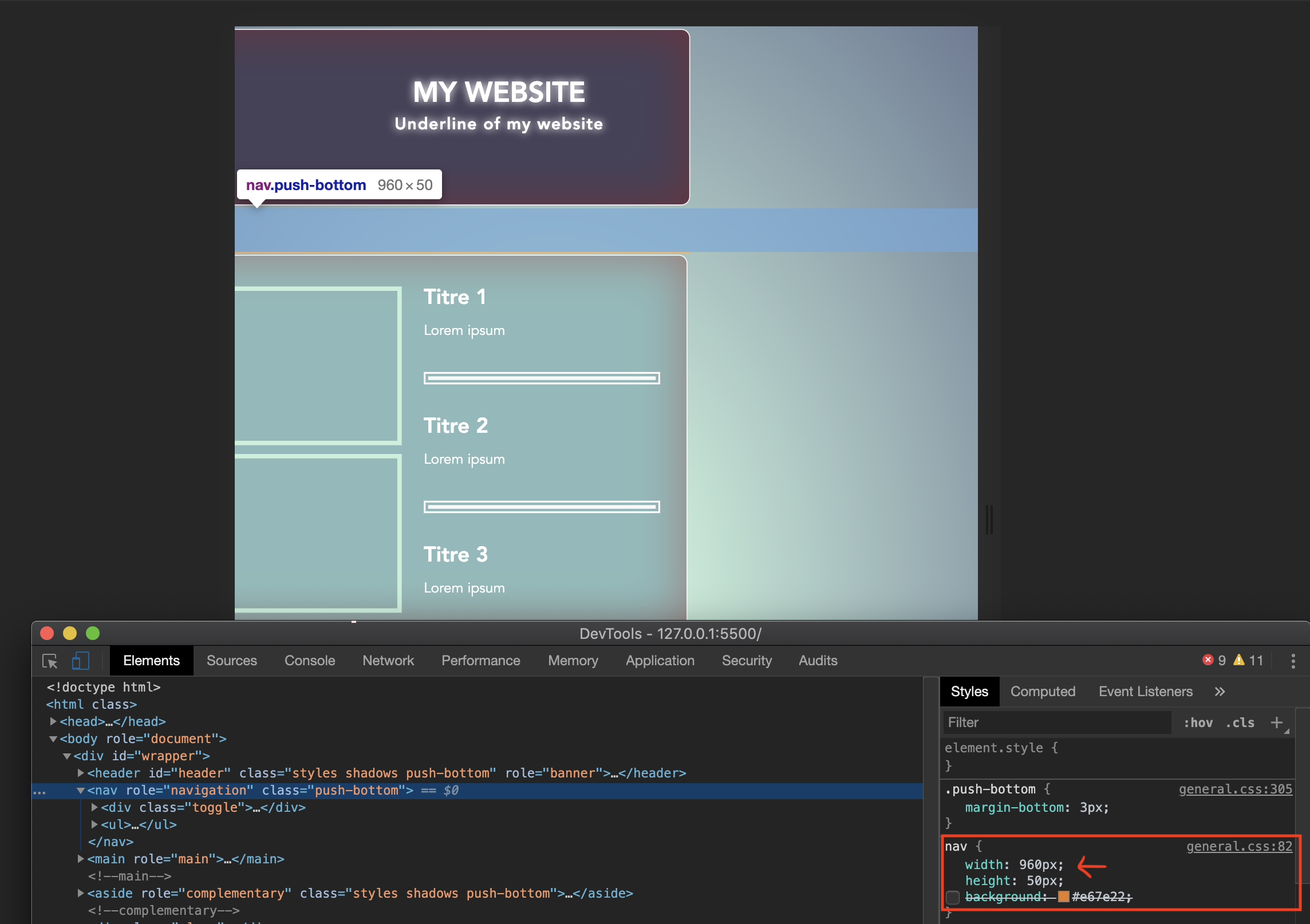
css
1@charset "UTF-8"; 2/***CSS general***/ 3html{ 4 height:100%; 5 max-height: 100%; 6} 7*{ 8 margin-top: 0; 9 padding: 0; 10} 11body{ 12 font-family: 'Avenir', sans-serif; 13 color: #fff; 14 text-align: justify; 15 /* Permalink - use to edit and share this gradient: https://colorzilla.com/gradient-editor/#a7e9af+0,ff4f4f+0,ff4f4f+0,a7e9af+0,c7f0db+0,c7f0db+2,c7f0db+2,c7f0db+17,6c7b95+100 */ 16 background: rgb(167,233,175); /* Old browsers */ 17 background: -moz-radial-gradient(center, ellipse cover, rgba(167,233,175,1) 0%, rgba(255,79,79,1) 0%, rgba(255,79,79,1) 0%, rgba(167,233,175,1) 0%, rgba(199,240,219,1) 0%, rgba(199,240,219,1) 2%, rgba(199,240,219,1) 2%, rgba(199,240,219,1) 17%, rgba(108,123,149,1) 100%); /* FF3.6-15 */ 18 background: -webkit-radial-gradient(center, ellipse cover, rgba(167,233,175,1) 0%,rgba(255,79,79,1) 0%,rgba(255,79,79,1) 0%,rgba(167,233,175,1) 0%,rgba(199,240,219,1) 0%,rgba(199,240,219,1) 2%,rgba(199,240,219,1) 2%,rgba(199,240,219,1) 17%,rgba(108,123,149,1) 100%); /* Chrome10-25,Safari5.1-6 */ 19 background: radial-gradient(ellipse at center, rgba(167,233,175,1) 0%,rgba(255,79,79,1) 0%,rgba(255,79,79,1) 0%,rgba(167,233,175,1) 0%,rgba(199,240,219,1) 0%,rgba(199,240,219,1) 2%,rgba(199,240,219,1) 2%,rgba(199,240,219,1) 17%,rgba(108,123,149,1) 100%); /* W3C, IE10+, FF16+, Chrome26+, Opera12+, Safari7+ */ 20 filter: progid:DXImageTransform.Microsoft.gradient( startColorstr='#a7e9af', endColorstr='#6c7b95',GradientType=1 ); /* IE6-9 fallback on horizontal gradient */ 21 22 background-attachment: fixed; 23} 24#wrapper{ 25 position:relative; 26 width: 960px; 27 height: 1024px; 28 max-width:960px; 29 margin: 0 auto; 30} 31#header{ 32 height:200px; 33 background:#464159; 34 margin-top:3px; 35} 36 37.fa-battle-net{ 38 float: left; 39 padding: 40px 0 0 47px; 40 text-shadow: 0 0 10px #fff 41} 42 43 44.toggle{ 45 width:100%; 46 padding:10px 20px; 47 text-align: right; 48 box-sizing: border-box; 49 font-size: 30px; 50 display:none; 51} 52@media (max-width:768px) 53{ 54 .toggle{ 55 display:block; 56 } 57 ul{ 58 width:100%; 59 display:none; 60 } 61 ul li{ 62 display:block; 63 text-align: center; 64 } 65 .active{ 66 display:block; 67 } 68} 69 70hgroup{ 71 padding-top: 50px; 72 margin-left: 200px; 73} 74h1, h3{ 75 margin: 0; 76 padding: 0; 77 text-shadow: 0 0 10px #fff; 78} 79h3{ 80 letter-spacing: 1px; 81} 82nav{ 83 width: 960px; 84 height: 50px; 85 /*background:#e67e22;*/ 86} 87/****Menu Navigation***/ 88nav ul{ 89 width: 960px; 90 height:50px; 91 margin: 0; 92 padding: 0; 93} 94nav ul li{ 95 float:left; 96 list-style:none; 97} 98nav ul li a{ 99 font-family: 'Avenir', sans-serif; 100 font-weight: bold; 101 display: block; 102 width: 157.5px; 103 height: 50px; 104 line-height:50px; 105 text-align: center; 106 color:#fff; 107 text-transform: uppercase; 108 text-decoration: none; 109 /***Transition***/ 110 transition:background 0.9s ease-out; 111 -moz-transition:background 0.9s ease-out; 112 -webkit-transition:background 0.9s ease-out; 113 -o-transition:background 0.9s ease-out; 114 /***Fin***/ 115} 116 117 nav ul li a:link{ 118 background:#6c7b95; 119 } 120/* nav ul li a:visited{ 121 background:green; 122 }*/ 123 nav ul li a:hover{ 124 background:#fff; 125 color:#8bbabb; 126 } 127 nav ul li a:active{ 128 background:blue; 129 } 130/***Fin***/ 131 main{ 132 float: left; 133 width: 66.7%; 134 } 135 section{ 136 height: inherit; 137 background: #8bbabb; 138 } 139 main section article { 140 padding:35px 45px 20px 45px; 141 } 142 main section article img{ 143 width:250px; 144 height:170px; 145 } 146 main section hr{ 147 margin:0 30px 0 30px; 148 border:7px double #fff; 149 } 150 main section article p{ 151 color: #fff; 152 text-align: justify; 153 } 154 main section article h2{ 155 margin-top:-20px; 156 margin-bottom: 10px; 157 } 158 main section article img{ 159 float:left; 160 margin:0 25px 10px 0; 161 border:5px solid #c7f0db; 162 } 163 aside{ 164 float:left; 165 width: 33.301%; 166 height: 100%; 167 background: #c7f0db 168 } 169 aside p{ 170 color: #fff; 171 text-align: justify; 172 padding: 100px 33px; 173 } 174 aside hr{ 175 margin:0 30px 0 30px; 176 border:7px double #fff; 177 } 178 179 #googlemaps{ 180 181 } 182 #googlemaps iframe{ 183 display:block; 184 width:255px; 185 height: 255px; 186 position:relative; 187 margin:30px auto; 188 border:5px solid #fff !important; 189 box-sizing: border-box; 190 191 } 192 #social{ 193 width: 99%; 194 height: 100%; 195 } 196 /***Réseaux sociaux***/ 197 #social ul{ 198 margin:30px 30px 0 30px; 199 background:#000; 200 } 201 #social ul li{ 202 float:left; 203 list-style: none; 204 transition:all 0.9s ease-in; 205 -moz-transition:all 0.9s ease-in; 206 -webkit-transition:all 0.9s ease-in; 207 -o-transition:all 0.9s ease-in; 208 } 209 210 #social ul li:not(.btn-google) { 211 margin-right: 10px; 212 213 } 214 #social ul li a{ 215 display:block; 216 width:75px; 217 height: 75px; 218 border:7px solid #fff; 219 box-sizing: border-box; 220 text-indent:-10000px; 221 } 222 /***Fin***/ 223 224 /***Sprite Sheets***/ 225 #social ul li:first-child{ 226 background:url(../images/social-icons-ssh.gif)left top; 227 } 228 #social ul li:first-child:hover{ 229 background:url(../images/social-icons-ssh.gif)left bottom; 230 } 231 232 #social ul li:nth-child(2){ 233 background:url(../images/social-icons-ssh.gif) -75px top; 234 } 235 #social ul li:nth-child(2):hover{ 236 background:url(../images/social-icons-ssh.gif) -75px bottom; 237 } 238 239 #social ul li:last-child{ 240 background:url(../images/social-icons-ssh.gif) -150px top; 241 } 242 #social ul li:last-child:hover{ 243 background:url(../images/social-icons-ssh.gif) -150px bottom; 244 } 245 /***Fin***/ 246 247 footer{ 248 height:100px; 249 background:#464159; 250 } 251 footer h3 a{ 252 display: block; 253 font-family: 'Roboto Slab', serif; 254 position: relative; 255 margin: 0 auto; 256 font-size: 10px; 257 text-align:center; 258 line-height:100px; 259 color: #fff; 260 text-decoration: underline; 261 } 262 263 /***CallToAction Group***/ 264 .calls_float{ 265 float: left; 266 } 267 #calls{ 268 width: 100%; 269 height: 69px; 270 } 271 #call1{ 272 width:33%; 273 height:100%; 274 background: #6c7b95 275 } 276 #call2{ 277 width:33%; 278 height:100%; 279 background: #8bbabb; 280 } 281 #call3{ 282 width:32.7%; 283 height:100%; 284 background: #c7f0db; 285 } 286 /***Fin CallToAction Group***/ 287 /***Fin Main Content***/ 288 289 290 /***MISE EN FORME***/ 291 292 .styles{ 293 -webkit-box-sizing:border-box; 294 box-sizing:border-box; 295 border:1px solid #fff; 296 border-radius:10px; 297 -moz-border-radius:10px; 298 -webkit-border-radius:10px; 299 -o-border-radius:10px; 300 } 301 .shadows{ 302 -webkit-box-shadow: inset 0 0 50px 0.5px rgba(168, 0, 0, 0.40); 303 box-shadow: inset 0 0 50px 0.5px rgba(168, 0, 0, 0.40); 304 } 305 .push-bottom{ 306 margin-bottom: 3px; 307 } 308 .push-right{ 309 margin-right: 3px; 310 } 311 /***Fin Effets***/ 312 .clear{ 313 clear: both; 314 } 315 .nomargin{ 316 margin-right:0; 317 }
css
1@charset "UTF-8"; 2/***スマホ用***/ 3@media screen and (max-width:480px) { 4 body{ 5 max-width: 480px; 6 } 7 #header{ 8 text-align: center; 9 font-size: 8px; 10 max-width: 480px; 11 } 12 13 section{ 14 max-width: 480px; 15 } 16 17 aside{ 18 width: 100%; 19 } 20 21 #calls{ 22 display:none; 23 } 24 25}
media queriesを変えて、コードを読み返しました。しかしどこが原因なのか分かりません。
Sublime Text Version 3.2.2
回答2件
あなたの回答
tips
プレビュー
 ベストアンサー


