

 Q&A
Q&A
(質問文は編集できます)質問文のコードはそれぞれコードブロックで囲んでいただけませんか? ```(バッククオート3つ)で囲み、前後に改行をいれるか、コードを選択して「<code>」ボタンを押すとコードブロックになります。
投稿2020/01/15 12:00
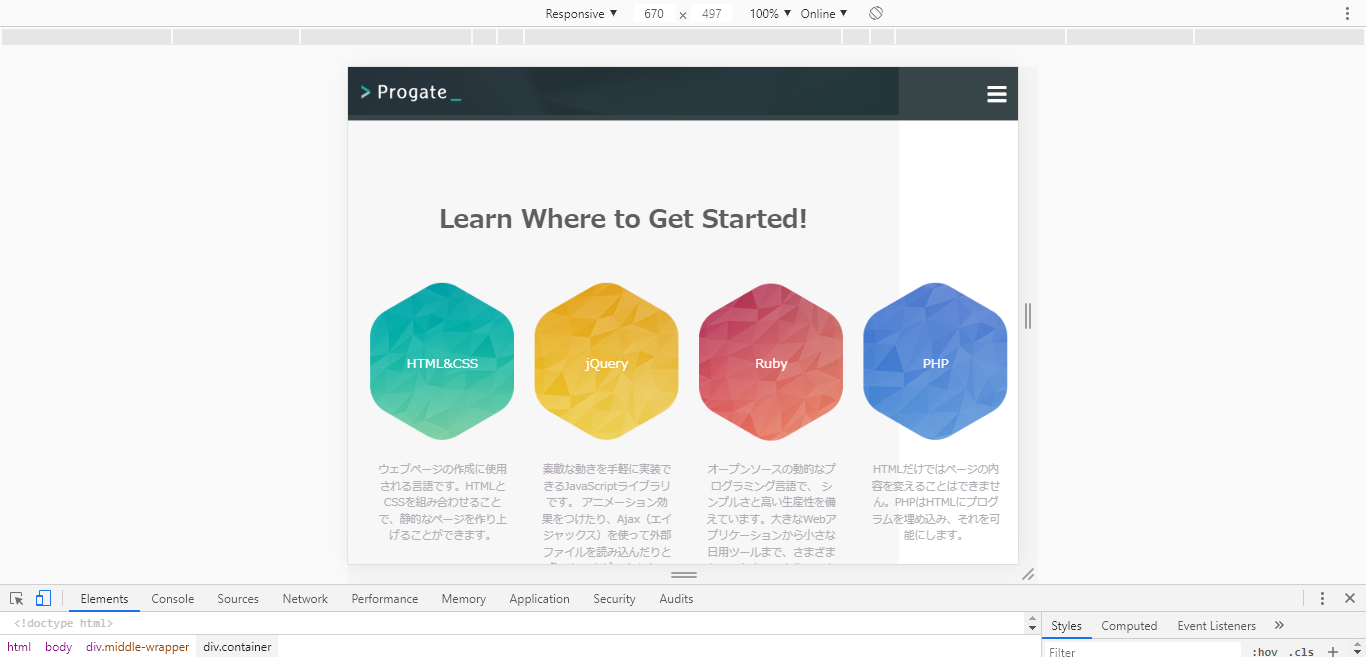
編集2020/01/15 12:14webサイトをレスポンシブデザインに対応させたいです。
lessonクラスのwidthを50%や100%に指定しても、見た目が変わりません。
どのように指定すればよいのでしょうか。
よろしくお願いいたします。

・index.html
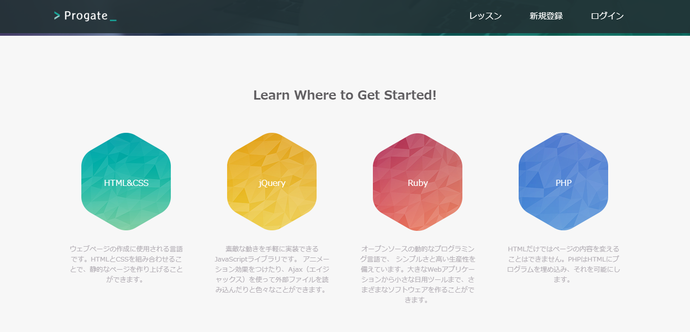
<div class="middle-wrapper">
      <div class="container">
        <div class="heading">
          <h2>Learn Where to Get Started!</h2>
        </div>
        <div class="lessons">
          <div class="lesson">
            <div class="lesson-icon">
              <img src="https://prog-8.com/images/html/advanced/html.png">
              <p>HTML&CSS</p>
            </div>
            <p class="text-contents">ウェブページの作成に使用される言語です。HTMLとCSSを組み合わせることで、静的なページを作り上げることができます。</p>
          </div>
          <div class="lesson">
            <div class="lesson-icon">
              <img src="https://prog-8.com/images/html/advanced/jQuery.png">
              <p>jQuery</p>
            </div>
            <p class="text-contents">素敵な動きを手軽に実装できるJavaScriptライブラリです。 アニメーション効果をつけたり、Ajax(エイジャックス)を使って外部ファイルを読み込んだりと色々なことができます。</p>
          </div>
          <div class="lesson">
            <div class="lesson-icon">
              <img src="https://prog-8.com/images/html/advanced/ruby.png">
              <p>Ruby</p>
            </div>
            <p class="text-contents">オープンソースの動的なプログラミング言語で、 シンプルさと高い生産性を備えています。大きなWebアプリケーションから小さな日用ツールまで、さまざまなソフトウェアを作ることができます。</p>
          </div>
          <div class="lesson">
            <div class="lesson-icon">
              <img src="https://prog-8.com/images/html/advanced/php.png">
              <p>PHP</p>
            </div>
            <p class="text-contents">HTMLだけではページの内容を変えることはできません。PHPはHTMLにプログラムを埋め込み、それを可能にします。</p>
          </div>
        </div>
      </div>
    </div>
・style.css
.middle-wrapper {
  height: 580px;
  background-color: #f7f7f7;
  text-align: center;
}

.heading {
  color: #5f5d60;
  padding-top: 80px;
  font-weight: normal;
}

.lessons {
  display: flex;
  margin-top: 50px;
}

.lesson {
  width: 25%;
}

.lesson-icon {
  position: relative;
}

.lesson-icon p {
  position: absolute;
  top: 75px;
  width: 100%;
  color: white;
}

.text-contents {
  color: #b3aeb5;
  font-size: 13px;
  width: 80%;
  margin: 0 auto;
  margin-top: 15px;
}
・responsive.css
@media screen and (max-width: 1000px) {
  .heading {
    font-size: 20px;
  }

  .lesson {
    width: 50%;
    margin-bottom: 50px;
  }
}

@media screen and (max-width: 670px) {
  .lesson {
    width: 100%;
  }
}
回答1件
あなたの回答
tips
プレビュー
 ベストアンサー

