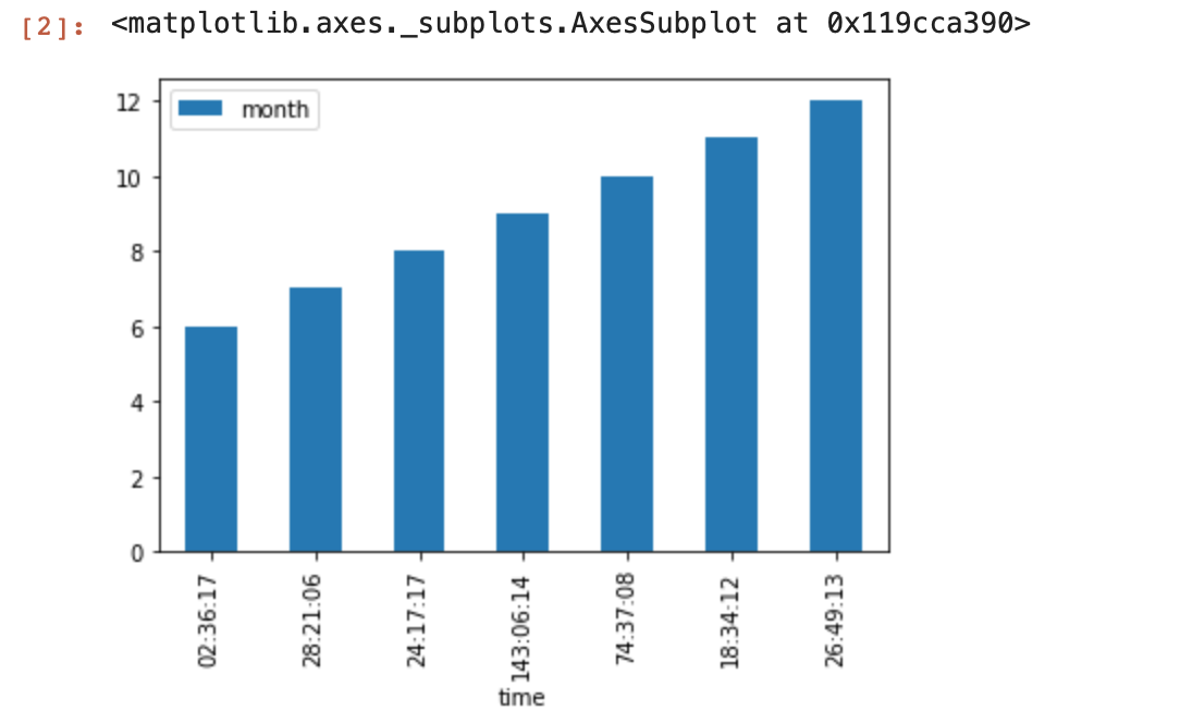
出来ましたがけっこう面倒ですね。肝はy値を秒数で管理し、グラフ描画時に時分秒に直すという点でしょうか。
参考:
How to deal with time values over 24 hours in python?
matplotlib: change yaxis tick labels
Convert a timedelta to days, hours and minutes
Python
1import pandas as pd
2from io import StringIO
3import datetime
4
5import matplotlib.pyplot as plt
6import matplotlib as mpl
7
8s = """month,time
96,02:36:17
107,28:21:06
118,24:17:17
129,143:06:14
1310,74:37:08
1411,18:34:12
1512,26:49:13"""
16
17# hour:minute:sec 形式の文字列tmからtotal seconds(int)を返す
18def to_sec(tm):
19 h, m, s = tm.split(':')
20 td = datetime.timedelta(hours=int(h), minutes=int(m), seconds=int(s))
21 return int(td.total_seconds())
22
23# メジャー軸のラベル文字列を生成する関数
24# x(total seconds) -> "hour:minute:sec"
25def mjrFormatter(x, pos):
26 td = datetime.timedelta(seconds=int(x))
27 h, remainder = divmod(td.seconds, 3600)
28 m, s = divmod(remainder, 60)
29 return '{}:{:02d}:{:02d}'.format(td.days*24 + h, m, s)
30
31
32# 読込
33df = pd.read_csv(StringIO(s))
34df['time'] = df['time'].apply(to_sec)
35
36# メジャー軸のラベル文字列を生成する関数を指定
37fig, ax = plt.subplots()
38ax.yaxis.set_major_formatter(mpl.ticker.FuncFormatter(mjrFormatter))
39
40# y軸の目盛を設定
41DAY_SEC = 24*3600
42max_sec = (max(df['time']//DAY_SEC) + 2) * DAY_SEC # rangeの第2引数は未満までなので+2日する
43yticks = list(range(0, max_sec, DAY_SEC))
44ax.set_yticks(yticks)
45
46# 描画
47ax.bar(df['month'],df['time'])
48fig.show()