

 Q&A
Q&A
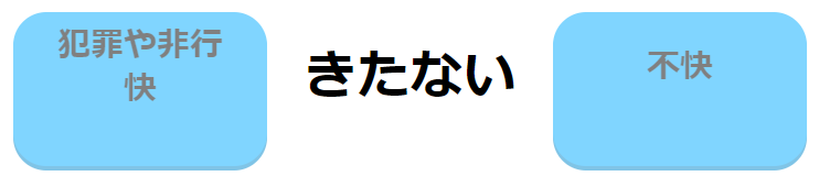
画像のような並びに表示がしたいです。
ですが、<meta name="viewport" content="width=device-width,initial-scale=1">
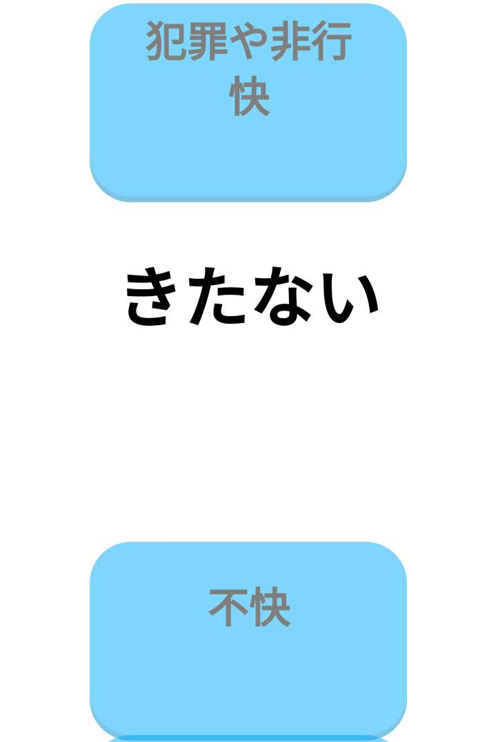
を使って、スマホ画面に表示させるとどうしても下のような並びになってしまいます。
<meta name="viewport" content="width=device-width,initial-scale=1">を付けないと、表示が小さいので、どうにかして3つのinline-blockがどんな画面幅でも横並びになるような方法を教えてください。
よろしくお願いします。
<!--index.php-->
 <div>
      <div class="box1 boxstyle" id="box_0" data-id="0"><br>犯罪や非行<br><br>快</div>
      <div class="prob inline"><?= h($quiz[0]); ?></div>
      <div class="box1 boxstyle" id="box_1" data-id="1"><br><br>不快</div>
 </div>
//style.css
.boxstyle {
  width: 230px;
  height: 140px;
  opacity: 0.5;
  cursor: pointer;

  color: #000;
  font-size: 30px;
  font-weight: bold;
  line-height: 20px;

  vertical-align: middle;

  display: inline-block;

  cursor: pointer;
  border-radius: 30px;
  font-weight: bold;
  background: #00aaff;
  box-shadow: 0 4px 0 #0088cc;
  color: #000;


.prob{
  width: 250px;
  height: 250px;
  opacity: 1.0;
  color: #000;
  font-size: 48px;/*48*/
  font-weight: bold;
  line-height: 150px;
}


.inline{
  display: inline-block;
}
}
回答1件
 ベストアンサー
あなたの回答
tips
プレビュー


バッドをするには、ログインかつ
こちらの条件を満たす必要があります。
2019/07/14 14:27 編集
2019/07/14 14:30
2019/07/19 11:41