

 Q&A
Q&A
レスポンシブデザインであれば
metaも記載されていなければ意味がないです。
投稿2019/06/27 10:46
編集2019/06/27 14:04初めての質問失礼致します。
現在,HTML・Bootstrap・CSSを用いて、WEBサイトを作っている最中ですが、
最後のレスポンシブデザインで躓いています。
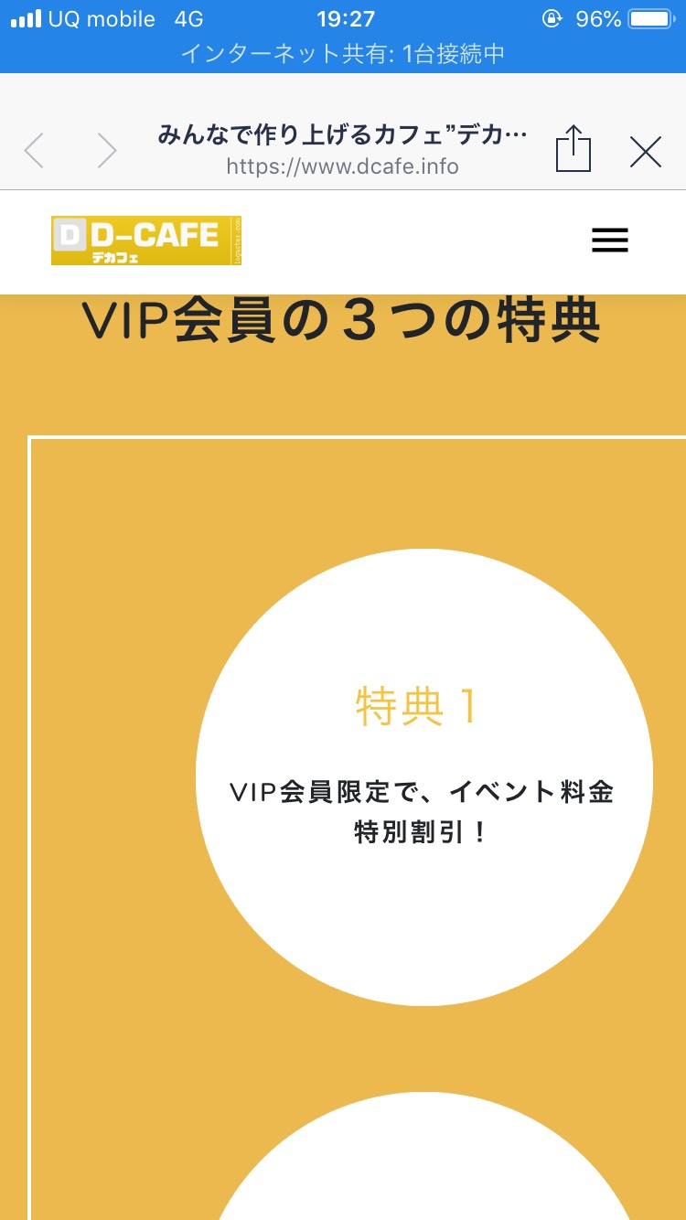
具体的には、スマホサイズの表記の時に、
一部分のレイアウトが崩れてしまう状況です。
Google developper toolでスマホサイズを確認した時は、
レイアウト崩れがなかったので、もしかしたらサーバーのアップロード状況かなと思いましたが、
キャッシュを削除してのアップロードでも治りませんでした。
よろしければ、解決策をご教示ください。
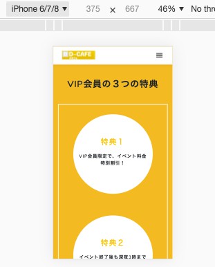
【HTML】
            <section class="section special" id="vip">
            <div class="container">
                <div class="row text-center">
                    <div class="col-lg-12">
                            <h2>VIP <span class="font-weight-bold">SYSTEM
                            </span></h2>
                            <div class="header-underline underline-white"></div>
                            <p class="mx-auto section-subtitle mt-4 font-weight-bold txt">
                                デカフェのイベントでは、何回も来てくれる方に向けてVIP会員をオススメしています。
                            </p>
                    </div>
                    <div class="col-md-12 text-center">
                        <p class="mt-3 pb-4 txt1">VIP会員の3つの特典</p>
                    </div>
                </div>
                <div class="row">
                    <div class="col-md-12">
                            <div class="vipbox-container">
                                <div class="row">
                                    <div class="col-lg-4 col-sm-12">
                                        <div class="text-center tokuten">
                                            <div class="tokuten-box text-center">
                                                <p class="tokuten-contents">特典1</p>
                                                <p class="txtm">VIP会員限定で、イベント料金特別割引!</p>
                                            </div>
                                        </div>
                                    </div>
                                    <div class="col-lg-4 col-sm-12">
                                        <div class="tokuten">
                                            <div class="tokuten-box text-center">
                                                <p class="tokuten-contents">特典2</p>
                                                <p class="txtm">イベント終了後も深夜3時まで追加料金なしで参加可能!</p>
                                            </div>
                                        </div>
                                    </div>
                                    <div class="col-lg-4 col-sm-12">
                                        <div class="tokuten">
                                            <div class="tokuten-box text-center">
                                                <p class="tokuten-contents">特典3</p>
                                                <p class="txtm">1,000円で店内にあるドリンク<br>飲み放題!</p>
                                            </div>
                                        </div>
                                    </div>
                                </div>
                            </div>
                    </div>
                    <div class="col-md-12 text-center mt-5">
                            <a href="https://twitter.com/dcafe_1000yen" class="btn btn-custom3 btn-round">Twitterをチェック‼︎</a>
                    </div>
                </div>
            </div>
        </section>

【CSS】
.txt1 {
    font-size: 28px;
    font-weight: 600;

}


.vipbox-container {

    width: 100%;
    border: 2px solid #fff;
    display: table;
    text-align: center;
    overflow: hidden;
    /* tablecellにtext-align: center;を */

}


/* .tokuten-block {
    display: table;
    margin: 20px 0;
} */

.tokuten {
    width: 250px;
    height: 250px;
    background-color: #fff;
    border-radius: 50%;
    display: inline-block;
    margin: 30px auto;
}

.tokuten-box {
    /* width: auto;  */
    padding: 15px;
    height: 250px;
    display: table-cell;
    vertical-align: middle;
}

.tokuten-contents {
    font-size: 24px;
    font-weight: 500;
    color: #f7c23c;

}

.txtm {
    font-weight: 600;
    font-size: 14px;
}


/*===========================
        11.RESPONSIVE
=============================*/

@media (min-width: 200px) and (max-width: 768px) {

    .body {

        font-size: 18px;
    }


    .contents {
        padding: 40px 0;
        text-align: center;
    }

    .custom-nav {
        background-color: #fff !important;
        padding: 10px 0px !important;
    }
    .custom-nav .container {
        width: 85%;
    }
    .custom-nav .navbar-toggler {
        color: #000;
        font-size: 26px;
        border: none;
    }
    .custom-nav .logo .logo-dark {
        display:inline-block;
    }
    .custom-nav .navbar-nav li a {
        color: rgba(0, 0, 0, 0.6) !important;
    }
    .custom-nav .logo .logo-light {
        display:none;
    }
    .h-100vh{
        height:auto;
    }
    .header-bg-img{
        clip-path: none;
    }
    .custom-nav .navbar-nav li a {
        margin: 0 0px;
        line-height: 15px;
    }
    .header-name{
        font-size:38px;
    }

    .container {
        max-width: 0 auto;
        /* width: 100%; */
        margin: 0 auto;
        overflow: hidden;
    }


}
・サーバーのアップロード
・グーグルのツール検証
・他の人の携帯でサイトを見てもらった
・widthの調整
・overflow: hidden;調整
どうぞ、よろしくお願いします。
回答1件
あなたの回答
tips
プレビュー
 自己解決
自己解決

