

pandasでデータフレームを作成してmatplotlibで作図したいと考えています.
・データはExcelからpandasで読み込みました.
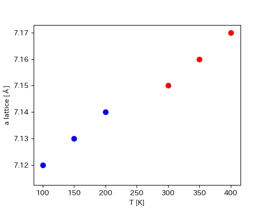
・作図をしたところ, 以下の二つのグラフが生成されました.
Python
1#データ生成 2import pandas as pd 3import matplotlib.pyplot as plt 4input_book = pd.ExcelFile('data.xlsx') 5input_file_name = 'data.xlsx' 6input_book = pd.ExcelFile(input_file_name) 7input_sheet_name = input_book.sheet_names 8 9input_sheet_df3 = input_book.parse(input_sheet_name[3]) 10input_sheet_df4 = input_book.parse(input_sheet_name[4]) 11 12#作図 13fig = plt.figure(figsize=(10,8)) 14ax1 = plt.subplot2grid((2,2), (0,0)) 15ax2 = plt.subplot2grid((2,2), (0,1)) 16 17ax1.scatter(input_sheet_df3['T (K)'], input_sheet_df3['a'], linewidth=2, c='b') 18ax2.scatter(input_sheet_df4['T (K)'], input_sheet_df4['a'], linewidth=2 , c='red') 19 20ax1.set_xlabel('T [K]') 21ax2.set_xlabel('T [K]') 22ax2.set_ylabel('a lattice [Å]')
生成されたグラフ

実現したい内容
・2つのグラフを1つのグラフに統合したい.
・以下の模式図のようデータを1つのグラフに結合したい.

よろしくお願いします.
回答2件
あなたの回答
tips
プレビュー


バッドをするには、ログインかつ
こちらの条件を満たす必要があります。