

 Q&A
Q&A
CSSタグを追加すると回答が得られやすいと思います
投稿2019/05/14 05:46
編集2019/05/14 06:45CSS3のflexboxを使ったスタイルで、要素を50pxずつの幅で区切っていくデザインを考えています。
完成図は次のようなものです。
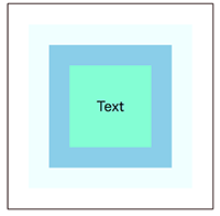
コンテナ用にcontainerクラスを定義後、内側のアイテム用にitemクラスを定義しました。
アイテムの各要素のタグに幅を設定して作成しましたが、
より良い方法はないでしょうか?
ご助言いただけるとありがたいです。
html
1<!DOCTYPE html> 2<html> 3<head> 4<meta charset="utf-8" /> 5<title>flexbox</title> 6<style> 7.container { 8 display: flex; 9 justify-content: center; 10 align-items: center; 11 12 border: 1px solid #1b0303; 13 width: 250px; 14 height: 250px; 15 margin: auto; 16} 17 18.item{ 19 display: flex; 20 justify-content: center; 21 align-items: center; 22 background-color: azure; 23} 24</style> 25</head> 26<body> 27<div class="container"> 28 <div class="item" style="width:200px;height:200px"> 29 <div class="item" style="width:150px;height:150px;background-color: skyblue"> 30 <p class="item" style="width:100px;height:100px;background-color: aquamarine">Text</p> 31 </div> 32 </div> 33</div> 34</body> 35</html>
回答1件
あなたの回答
tips
プレビュー
 ベストアンサー


