

 Q&A
Q&A
子要素に「inline-block」がありますが、flexで並べるのなら不要です。
投稿2019/03/14 11:46
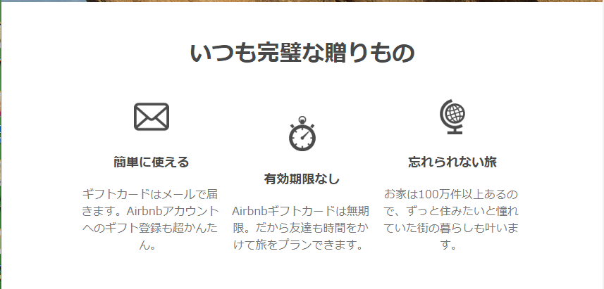
現在、airbnbのページ模写をしており、レスポンシブ化したところ、サイズを小さくした際に、flexboxを設定している部分の真ん中の子要素がずれてしまいます。
この子要素を上部揃えにしたいです。
html
1 <div class="concepts-wrap"> 2 <div class="container"> 3 <h2>いつも完璧な贈りもの</h2> 4 <div class="consepts"> 5 <div class="consept"> 6 <img src="img/icon_1.png"> 7 <h3>簡単に使える</h3> 8 <p>ギフトカードはメールで届きます。Airbnbアカウントへのギフト登録も超かんたん。</p> 9 </div> 10 <div class="consept"> 11 <img src="img/icon_2.png"> 12 <h3>有効期限なし</h3> 13 <p>Airbnbギフトカードは無期限。だから友達も時間をかけて旅をプランできます。</p> 14 </div> 15 <div class="consept"> 16 <img src="img/icon_3.png"> 17 <h3>忘れられない旅</h3> 18 <p>お家は100万件以上あるので、ずっと住みたいと憧れていた街の暮らしも叶います。</p> 19 </div> 20 </div> 21 </div> 22 </div>
css
1* { 2 font-family: Circular, -apple-system, BlinkMacSystemFont, Roboto, "Helvetica Neue", sans-serif; 3 margin: 0; 4 padding: 0; 5 box-sizing: border-box; 6} 7 8.container { 9 max-width: 1050px; 10 margin: 0 auto; 11} 12 13/* concepts-wrap */ 14 15.concepts-wrap { 16 text-align: center; 17 margin: 50px 0; 18} 19 20.concepts-wrap h2 { 21 font-size: 32px; 22 color: #484848; 23 margin-bottom: 40px; 24} 25 26.concepts { 27 display: flex; 28 margin: 0; 29} 30 31.consepts img { 32 height: 50px; 33 width: 50px; 34} 35 36.consepts h3 { 37 font-size: 18px; 38 color: #484848; 39 margin: 20px 0; 40} 41 42.consepts p { 43 font-size: 16px; 44 color: #767676; 45} 46 47.consept { 48 display: inline-block; 49 width: 32%; 50} 51 52.consept p { 53 width: 98%; 54} 55 56/* resposive */ 57 58@media(max-width: 1100px) { 59 .header-right { 60 display: none; 61 } 62 63 .top-wrap .container { 64 max-width: 650px; 65 } 66 .concepts-wrap .container { 67 max-width: 650px; 68 } 69 .mid-wrap .container { 70 max-width: 650px; 71 } 72 73}
aline-itemsのflex-startやalign-selfのflex-startなどを試してみましたが何も変化はありませんでした。
回答1件
あなたの回答
tips
プレビュー
 ベストアンサー


