

 Q&A
Q&A 自己解決
自己解決
bootstrapを使用していますので、
もともとViewportの記述があります。
投稿2015/10/09 07:18
編集2015/10/16 10:15お世話になります。
現在サイトを制作しているのですが、
レスポンシブに関して問題があり質問させていただきます。
(bootstrap3.2.0テンプレートを元に編集して作成しています。
http://www.bootstrapzero.com/bootstrap-template/oleose)
背景画像を配置し、その上に文字を載せています。
画像は、media screenによって、スマホの場合、
スマホの画面サイズくらいの画像に置き換えられます。
動作チェックを行っていたところ、
PCでGoogle Chromeの横幅を小さくすると、ちゃんと表示されました。
Safariでも、ユーザーエージェントを変更して見るとちゃんと表示されます。
(画像参照)
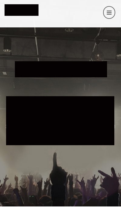
しかし、iPhoneの実機、XcodeのiOS simulatorのSafariで確認すると、
下の画像のように、大きすぎる画像が配置されてしまいます。

width100%指定などしても解決に至らず、質問させていただくこととしました。
参考程度に一部ソース、CSSを抜粋して貼り付けておきます。
html
1 <header> 2 3 <nav class="navbar navbar-default navbar-fixed-top" role="navigation"> 4 <div class="container"> 5 <!-- Brand and toggle get grouped for better mobile display --> 6 <div class="navbar-header"> 7 <button type="button" class="navbar-toggle" data-toggle="collapse" data-target="#bs-example-navbar-collapse-1"> 8 <span class="fa fa-bars fa-lg"></span> 9 </button> 10 <a class="navbar-brand" href="index.html"> 11 <img src="images/logo.png" alt="" class="logo" width="300"> 12 </a> 13 </div> 14 15 <!-- Collect the nav links, forms, and other content for toggling --> 16 <div class="collapse navbar-collapse" id="bs-example-navbar-collapse-1"> 17 18 <ul class="nav navbar-nav navbar-right"> 19 <li><a href="#about">a</a> 20 </li> 21 <li><a href="#features">b</a> 22 </li> 23 <li><a href="#reviews">c</a> 24 </li> 25 <li><a href="#screens">d</a> 26 </li> 27 <li><a href="#demo">e</a> 28 </li> 29 </ul> 30 </div> 31 <!-- /.navbar-collapse --> 32 </div> 33 <!-- /.container--> 34 </nav> 35 36 37 <div id="concept_area"> 38 <div id="concept" class="sp-effect3 scrollpoint white"> 39 <p>文章</p> 40 </div> 41 <div id="concept2" class="scrollpoint sp-effect3 white" > 42 <p>文章</p> 43 </div> 44 </div> 45 46 </header>
CSS
1 2.white{color:#ffffff;} 3#concept{padding-top:250px; padding-bottom:50px; font-size:35px;} 4#concept2{padding-bottom:20%; font-size:20px;} 5 6 header{background-image:url(../../images/top_img.jpg); 7 background-position: center center; 8 background-repeat: no-repeat; 9 background-attachment: fixed; 10 background-size: cover; 11 background-color: #464646; 12 } 13 14@media screen and (max-width: 730px) { 15header{ 16 background-image:url(../../images/s/top.jpg); 17 background-position: center center; 18 background-repeat: no-repeat; 19 background-attachment: fixed; 20 background-size: cover; 21 background-color: #464646; 22 } 23 #concept{padding-top:200px; padding-bottom:50px; font-size:20px;} 24#concept2{padding-bottom:50%; font-size:13px;} 25.smtmargin{padding-top:120px;} 26}
すみませんがご回答よろしくお願いいたします。
*コーポレートサイトのため、画像内のロゴや文章は消しています。
回答4件
あなたの回答
tips
プレビュー


バッドをするには、ログインかつ
こちらの条件を満たす必要があります。