

 Q&A
Q&A
windows8.1 ストアアプリを、visualstudio2015、OSはWindows10で開発しております。
今回は、ComboBox に関して質問です。
ComboBoxコントロールの標準は、

です。これを、

や
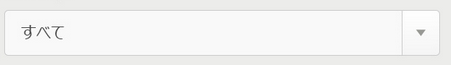
に、ComboBoxのデザインを編集したいです。
■変更したいデザイン
①角丸
②背景をグラデーション
③ドロップダウンボタン?テキスト?(右側の三角)
④テキスト部分(左側)と③の間に縦線(heightは自由に変更したい)
■ここまでできてます
●コード
C#
1<Grid Background ="{ThemeResource ApplicationPageBackgroundThemeBrush }"> 2 <Grid.RowDefinitions> 3 <RowDefinition/> 4 <RowDefinition/> 5 <RowDefinition/> 6 <RowDefinition/> 7 <RowDefinition/> 8 </Grid.RowDefinitions> 9 10 <!--0行目(デフォルト)--> 11 <ComboBox Width="580" Height ="60"> 12 <ComboBoxItem> リスト1</ComboBoxItem > 13 </ComboBox> 14 15 <!--1行目(いろいろお試し中)--> 16 <ComboBox Grid.Row ="1" Width="580" Height="60"> 17 <ComboBoxItem BorderBrush ="Red" BorderThickness="3" Background="#FF0E39AC" Height ="20" Width="20" RenderTransformOrigin="0.5,0.5"> 18 <ComboBoxItem.RenderTransform> 19 <CompositeTransform TranslateX ="20" TranslateY="24"/> 20 </ComboBoxItem.RenderTransform> 21 </ComboBoxItem> 22 </ComboBox> 23 24 25 <!--2行目(既存のスタイルテンプレート使用)--> 26 <!--<ComboBox x:Name="comboBox" Width="580" Height="60" Grid.Row="2" Style="{StaticResource ComboBoxStyle1}"/> 27 28 <!--3行目(とりあえず見た目だけでも近づけたい)--> 29 <Grid Width ="580" Height="60" Grid.Row="2"> 30 <Border CornerRadius ="5 5 5 5" BorderThickness="1,1,1,1" BorderBrush="Gray"> 31 <Border.Background> 32 <LinearGradientBrush EndPoint ="0.5,1" StartPoint="0.5,0"> 33 <GradientStop Color ="White" Offset="0"/> 34 <GradientStop Color ="#FFF5F5F5" Offset="1"/> 35 </LinearGradientBrush> 36 </Border.Background> 37 </Border> 38 <Border Background ="#FFCCCCCC" HorizontalAlignment="Right" Width="1" Height ="34" Margin="0 0 40 0"/> 39 <!--<UserControls:SortBtn Grid.Column="1" Width="13" Height="9" Margin="13 0 13 0" HorizontalAlignment="Right" VerticalAlignment="Center"/>--> 40 <TextBlock Grid.Column ="0" Margin="20 0 0 0" FontSize="22" VerticalAlignment ="Center" Text="リスト1" /> 41 42 </Grid> 43 44 45 </Grid > 46 47
●ビジュアル

探してもあまりないのですが、みなさんデフォルトのままで使用されているからなのでしょうか。
PHPの公式リファレンスのように、オブジェクトで検索したら細かく使用例を交えながら説明しているサイトがあれば教えていただきたいです。
コンボボックス/リストボックスを極めてるサイトがあればいいのですが。。。
__似た状況っぽいけど、
http://tryerror.net/tryerror/wordpress/post-205
WindowsApplicationとwindowsストアアプリとWindowsデスクトップアプリが同じことを指しているのかわからないので、同じ言語を使用できるか不明。
この辺にも書いてそうだけど、まだ解読する力がない。
http://sourcechord.hatenablog.com/entry/2014/10/25/205036
http://d.hatena.ne.jp/kaorun/20120908/1347100061
https://msdn.microsoft.com/ja-jp/library/ms749018(v=vs.110).aspx
http://www.moonmile.net/blog/archives/4087__
前回の質問、【Sliderのデザイン】では、プロパティがSliderにはなかったので、SliderをBoderでラッピングをすることで期待通りの結果が得られました。
ありがとうございました。
■□■□■□■□■□■□■□■□■□■□■□■□■
以上
お手数おかけしますが、宜しくお願いいたします。
回答1件
 ベストアンサー
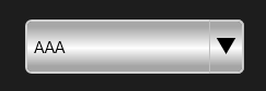
あなたの回答
tips
プレビュー


バッドをするには、ログインかつ
こちらの条件を満たす必要があります。
2015/09/30 08:16
2015/09/30 09:17
2015/10/01 03:27