

 Q&A
Q&A
主語がありません。何をシームレスにどうしたいのでしょうか。
投稿2018/12/21 07:44
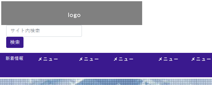
編集2019/01/15 08:29ブレイクポイントに関わらず縮小に応じてヘッダーの内容をシームレスに収縮させたいのですが、どうもうまくいかず困っております。画像をご参照ください。
●xl

↓ ↓ ↓
●lg~md
↓ ↓ ↓
●sm
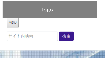
また最小サイズにした際、下記のようにメニューボタンと検索を横並びにさせたいです。
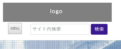
本当はハンバーガーメニューにしたいのですが、罫線が1本しか表示されずボタンの形にしてます。
三本線の下に「MENU」のテキストも入れたいです。
ちなみにbootstrap4です。ご教示いただけると幸いです。よろしくお願い申し上げます。
html
1 <div class="row modal-header"> 2 <div class="row col-md-10 offset-md-2 col-lg-10"> 3 <div class="col-md-auto col-lg-auto"> 4 <a href="index.html"><img src="images/large_logo.png" width="100%" alt="large_logo"></a> 5 </div> 6 <div class="col-md-5 col-lg-6 col-sm-5"> 7 <div class="col-md-3 col-sm-3 col-3"> 8 <button type="button" class="navbar-toggle" data-toggle="collapse" data-target="#navmenu"> 9 <span class="navbar-toggle-icon"> 10 <span class="navbar-text" style="font-size: 0.3rem;">MENU</span> 11 </span> 12 </button> 13 </div> 14 <div class="col-md-7 col-lg-10 col-sm-10 col-12" style="display: inline-block;"> 15 <form class="form-inline my-2 my-lg-0"> 16 <input class="form-control mr-sm-2" type="search" placeholder="サイト内検索" aria-label="Search"> 17 <button class="btn my-2 my-sm-0" type="submit">検索</button> 18 </form> 19 </div> 20 </div> 21 </div> 22 </div> 23 24 <!-- Start Header Navigation --> 25 <nav class="navbar navbar-header navbar-expand-lg"> 26 (中略) 27 </nav>
css
1/* nav */ 2 3.navbar { 4 background-color: #2E3091 !important; 5 text-align: center; 6 width: 100%; 7 font-size: 0.9rem; 8 padding: 0; 9} 10 11 12.nav-item a:link { 13 color: #000; 14} 15 16.nav-item a:hover { 17 color: #bba700 !important; 18} 19 20.nav-item .dropdown-item a:link { 21 color: #000000; 22} 23 24.nav-item .dropdown-item a:visited { 25 color: #000000; 26} 27 28.btn { 29 background-color: #2E3091; 30 border-style: none; 31 color: #fff; 32} 33 34/* min-width: 992px */ 35 36@media screen and (min-width: 992px) { 37 .navbar-toggle { 38 display: none; 39 } 40 41 .collapse { 42 display: block; 43 } 44} 45 46 47 48/* min-width: 768px */ 49 50@media screen and (min-width: 768px) { 51 .form-control { 52 width: 80% !important; 53 } 54 55} 56 57 58/* max-width: 578px */ 59 60@media screen and (max-width: 578px) { 61 .form-control { 62 width: 60% !important; 63 padding: 5px; 64 margin-right: 5px; 65 } 66} 67 68
回答1件
あなたの回答
tips
プレビュー
 自己解決
自己解決

