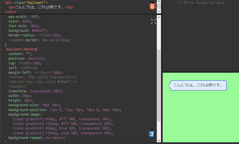
css
1body{
2 background: palegreen;
3}
4
5.balloon1 {
6 position: relative;
7 display: inline-block;
8 margin: 1.5em /*0*/;
9 padding: 7px 10px;
10 min-width: 120px;
11 max-width: 100%;
12 color: #555;
13 font-size: 16px;
14 background: #e0edff;
15 border-radius: /*15px*/5px;
16 /*added*/border: 1px solid blue;
17}
18.balloon1:before{
19 content: "";
20 position: absolute;
21 top: /*100%*/50%;
22 left: /*50%*/0;
23 margin-left: /*-15px*/-20px;
24 /*border: 10px solid transparent;*/
25 /*border-top: 15px solid #e0edff;*/
26 /*added*/
27 transform: translateY(-50%);
28 width: 20px;
29 height: 20px;
30 background-size: 10px 10px;
31 background-position: 11px 0, 11px 10px, 10px 0, 10px 10px;
32 background-image:
33 linear-gradient(-45deg, #fff 50%, transparent 50%),
34 linear-gradient(-135deg, #fff 50%, transparent 50%),
35 linear-gradient(-45deg, blue 50%, transparent 50%),
36 linear-gradient(-135deg, blue 50%, transparent 50%);
37 background-repeat: no-repeat;
38}
39
40.balloon1 p {
41 margin: 0;
42 padding: 0;
43}
解説:
css
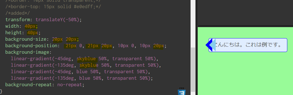
1.balloon1:before{
2 position: absolute;
3 top: 50%;/*親要素の高さ50%分,下へ*/
4 transform: translateY(-50%);/*子要素自身の高さの50%分,上へ*/
5 width: 20px;/*幅*/
6 height: 20px;/*高さ*/
7
8 /*以下で背景画像生成*/
9 background-size: 10px 10px;/*背景画像の幅・高さを設定(4枚分を一括指定)*/
10 /*↓4枚の画像の位置を設定,右上(1px右へずらす),右下(1pxずらす),右上(枠の代替),右下(枠の代替)*/
11 background-position: 11px 0, 11px 10px, 10px 0, 10px 10px;
12 background-image:
13 /*↓12時から反時計回りに45度の方向,半分までは白,その先は透明*/
14 linear-gradient(-45deg, #fff 50%, transparent 50%),
15 /*↓12時から反時計回りに135度の方向,同上*/
16 linear-gradient(-135deg, #fff 50%, transparent 50%),
17 /*↓12時から反時計回りに45度の方向,半分までは青,その先は透明*/
18 linear-gradient(-45deg, blue 50%, transparent 50%),
19 /*↓12時から反時計回りに135度の方向,同上*/
20 linear-gradient(-135deg, blue 50%, transparent 50%);
21 background-repeat: no-repeat;/*画像の繰り返しをキャンセル*/
22}
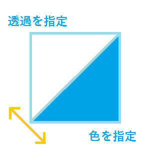
こういう感じの背景画像をCSSで生成して,良い感じに配置すると,枠線付きの三角形になります
分かりやすいように,サイズ・位置を変えたもの
色違いの背景画像を「少し左右にずらして配置」することで,枠線を表現していることが分かる


 Q&A
Q&A
 ベストアンサー


バッドをするには、ログインかつ
こちらの条件を満たす必要があります。
2018/09/02 12:21