

 Q&A
Q&A
「コードよく分かっておらず」のまま作っているのがそもそも間違っているのでは。商用サイトですかね?それを作成することでなにかしら利益を得ているわけですよね。自分でしっかり基礎の勉強もせず、質問サイトに頼りきって自分の利益にするのって、どうかと思います。
投稿2018/08/27 10:55
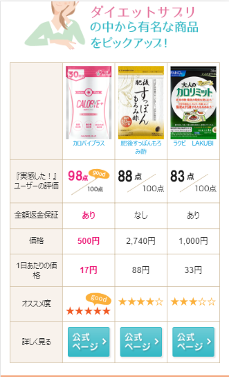
編集2018/08/28 00:35下記画像の比較表、スマホ表示だと現在3商品載せておりますが、
5商品まで追加して、テーブルの高さは変えず、横スクロール化をしたいです。
(以前質問時に解決しなかったのと、進展ありましたので、新しく投稿いたします。)
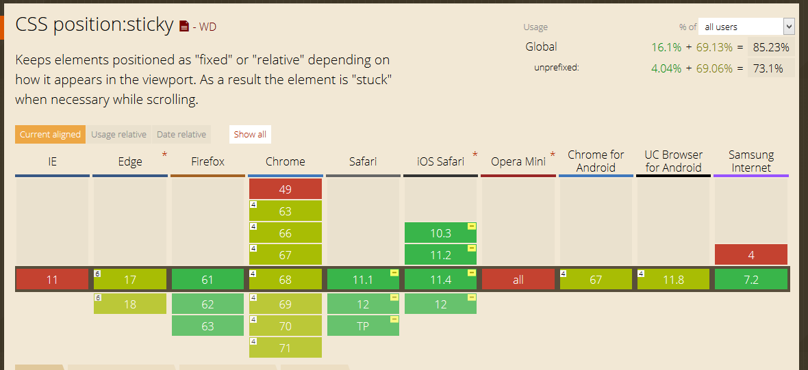
参考サイト
上記参考サイトが、まさにやりたいことなので、分かりやすいかと思います。
スマホ表示でテーブルを横スクロールできるようにしたいです。
上記参考サイトに従い、index.phpとstyle.cssにコードを追加しました。
テストとして、参考サイトのコードもそのままいれてみました。
(コードについては、下部「試したこと」参照)
下記画像のように、テーブルが画面の幅に収まって、スクロールできません。
また、列幅も小さくなってしまいました。
参考サイトのテーブル(画像下部の「ウェブコンサルティング」などのテーブル)は、正常にスクロールできているので、
元々の自分のテーブルのcssで何か引っかかってるのかもしてません。
web初心者のため、原因がわからず困っております。。

下記コードをstyle.cssに追加しました。
  .hikakuhyo-body { padding: 0 15px;
  width: 100%;
  overflow: auto;
  -webkit-overflow-scrolling: touch;
}
テスト用に参考サイトのコードもそのままいれました。
.table_container{
  width: 100%;
  overflow: auto;
  -webkit-overflow-scrolling: touch;
}
追加後style.css
.hikakuhyo { margin-bottom: 40px;}

.hikakuhyo h2 { text-align: center;}


@media screen and (min-width:768px){

  .hikakuhyo-body {
    background-image: url(images/hikakuhyo_top_pc_2.jpg);
    background-repeat: no-repeat;
    height: 486px;
  }

  .hikakuhyo-body2 {
    background-image: url(images/hikakuhyo_ranking_top_pc_2.jpg);
    background-repeat: no-repeat;
    height: 501px;
  }

}

@media screen and (max-width:767px){

  .hikakuhyo { margin-bottom: 20px;}

  .hikakuhyo h2 {
    padding: 0 15px;
    margin: 0 auto 10px auto;
  }

  .hikakuhyo h2 img { max-width: 291px;}

  .hikakuhyo-body { padding: 0 10px;}
  .hikakuhyo-body2 { padding: 0 10px;}

}

@media screen and (min-width:768px){

  .hikakuhyo-bottom {
    background-image: url(images/hikakuhyo_bottom_pc.png);
    background-repeat: no-repeat;
    height: 69px;
  }

  .hikakuhyo-body ul,
  .hikakuhyo-bottom ul {
  	display: table;
  	table-layout: fixed;
  	width: 650px;
  	margin: 0 0 0 130px;
  	padding: 6px 0 0 0;
  }
  .hikakuhyo-body2 ul,
  .hikakuhyo-bottom ul {
  	display: table;
  	table-layout: fixed;
  	width: 650px;
  	margin: 0 0 0 130px;
  	padding: 6px 0 0 0;
  }

  body.page-id-74 .hikakuhyo-body ul { padding: 28px 0 0 0;}

  .hikakuhyo-body ul li,
  .hikakuhyo-bottom ul li {
    display: table-cell;
    text-align: center;
  }
  .hikakuhyo-body2 ul { padding: 28px 0 0 0;}

  .hikakuhyo-body2 ul li,
  .hikakuhyo-bottom ul li {
    display: table-cell;
    text-align: center;
  }

  .hikakuhyo-body ul li img,
  .hikakuhyo-bottom ul li img { width: 120px;}
  .hikakuhyo-body2 ul li img,
  .hikakuhyo-bottom ul li img { width: 120px;}


}


@media screen and (max-width:767px){

  .hikakuhyo-body { padding: 0 15px;
  width: 100%;
  overflow: auto;
  -webkit-overflow-scrolling: touch;
 }

  .hikakuhyo-body table {
      border-left: 1px solid #d5c4a9;
      border-top: 1px solid #d5c4a9;
  }

  .hikakuhyo-body th,
  .hikakuhyo-body td {
      border-right: 1px solid #d5c4a9;
      border-bottom: 1px solid #d5c4a9;
      text-align: center;
      padding: 10px 5px;
      width: 25%;
  }

  .hikakuhyo-body th {
      font-size: 1.2rem;
      line-height: 1.4;
      background-color: #f8f2ec;
  }

  .hikakuhyo-body th.product-img {
      font-size: 1.0rem;
      background-color: #fff;
      color: #a68349;
      vertical-align: top;
      padding: 5px;
  }

  .hikakuhyo-body th.product-img img {
      display: block;
      margin: 0 auto;
  }

  .hikakuhyo-body th.product-img img.ranking-icon {
      width: 28px;
      margin-bottom: 4px;
  }

  .hikakuhyo-body td.btn-more { padding: 8px 5px 5px 5px;}

  .hikakuhyo-body td strong { color: #ed1e79; /* ピンク */ }

  .hikakuhyo-body td small { font-size: 1.0rem;}

}

.table_container{
  width: 100%;
  overflow: auto;
  -webkit-overflow-scrolling: touch;
}
index.php
<!-- ▽▽▽ 比較表 ▽▽▽ --> <div class="hikakuhyo"> <?php if (is_mobile()) : // スマホからのアクセスのみ表示 ?> <div class="hikakuhyo-body"> <table> <tr> <th> </th> <th class="product-img"><img src="<?php echo esc_url( get_template_directory_uri() ); ?>/images/calobyeplus_product_s.png" alt="カロバイプラス">カロバイプラス</a></th> <th class="product-img"><img src="<?php echo esc_url( get_template_directory_uri() ); ?>/images/suppon_product_s.png" alt="肥後すっぽんもろみ酢">肥後すっぽんもろみ酢</a></th> <th class="product-img"><img src="<?php echo esc_url( get_template_directory_uri() ); ?>/images/lakubi_product_s.png" alt="ラクビ LAKUBI">ラクビ LAKUBI</a></th> <th class="product-img"><img src="<?php echo esc_url( get_template_directory_uri() ); ?>/images/lakubi_product_s.png" alt="ラクビ LAKUBI">ラクビ LAKUBI</a></th> <th class="product-img"><img src="<?php echo esc_url( get_template_directory_uri() ); ?>/images/lakubi_product_s.png" alt="ラクビ LAKUBI">ラクビ LAKUBI</a></th> <th class="product-img"><img src="<?php echo esc_url( get_template_directory_uri() ); ?>/images/lakubi_product_s.png" alt="ラクビ LAKUBI">ラクビ LAKUBI</a></th> </tr> <tr> <th>『実感した!』ユーザーの評価</th> <td><img src="<?php echo esc_url( get_template_directory_uri() ); ?>/images/hikakuhyo_otona_point.png" alt="98点" class="point"></td> <td><img src="<?php echo esc_url( get_template_directory_uri() ); ?>/images/hikakuhyo_surattokiriri_point.png" alt="92点" class="point"></td> <td><img src="<?php echo esc_url( get_template_directory_uri() ); ?>/images/hikakuhyo_kokorokaradaanshinyousan_point.png" alt="90点" class="point"></td> <td><img src="<?php echo esc_url( get_template_directory_uri() ); ?>/images/hikakuhyo_kokorokaradaanshinyousan_point.png" alt="90点" class="point"></td> <td><img src="<?php echo esc_url( get_template_directory_uri() ); ?>/images/hikakuhyo_kokorokaradaanshinyousan_point.png" alt="90点" class="point"></td> <td><img src="<?php echo esc_url( get_template_directory_uri() ); ?>/images/hikakuhyo_kokorokaradaanshinyousan_point.png" alt="90点" class="point"></td> </tr> <tr> <th>全額返金保証</th> <td><strong class="pink">あり</strong></td> <td>なし</td> <td>あり</td> <td>あり</td> <td>あり</td> <td>あり</td> </tr> <tr> <th>価格</th> <td><strong class="pink">500円</strong></td> <td>2,740円</td> <td>1,000円</td> <td>1,000円</td> <td>1,000円</td> <td>1,000円</td> </tr> <tr> <th>1日あたりの価格</th> <td><strong class="pink">17円</strong></td> <td>88円</td> <td>33円</td> <td>33円</td> <td>1,000円</td> <td>1,000円</td> </tr> <tr> <th>オススメ度</th> <td><img src="<?php echo esc_url( get_template_directory_uri() ); ?>/images/hikakuhyo_otona_star.png" alt="5" class="star"></td> <td><img src="<?php echo esc_url( get_template_directory_uri() ); ?>/images/hikakuhyo_surusuru_star.png" alt="4" class="star"></td> <td><img src="<?php echo esc_url( get_template_directory_uri() ); ?>/images/hikakuhyo_komachi_star.png" alt="3" class="star"></td> <td><img src="<?php echo esc_url( get_template_directory_uri() ); ?>/images/hikakuhyo_komachi_star.png" alt="3" class="star"></td> <td><img src="<?php echo esc_url( get_template_directory_uri() ); ?>/images/hikakuhyo_komachi_star.png" alt="3" class="star"></td> <td><img src="<?php echo esc_url( get_template_directory_uri() ); ?>/images/hikakuhyo_komachi_star.png" alt="3" class="star"></td> </tr> <tr> <th>詳しく見る</th> <td class="btn-more"><a href="https://calobyeplus.jp"><img src="<?php echo esc_url( get_template_directory_uri() ); ?>/images/hikakuhyo_btn_more_sp.png" alt="公式サイトへ"></a></td> <td class="btn-more"><a href="https://yu-me-ya.com/sp/items/higo-suppon"><img src="<?php echo esc_url( get_template_directory_uri() ); ?>/images/hikakuhyo_btn_more_sp.png" alt="公式サイトへ"></a></td> <td class="btn-more"><a href="https://www.u-u-kan.jp/item/01/lb/"><img src="<?php echo esc_url( get_template_directory_uri() ); ?>/images/hikakuhyo_btn_more_sp.png" alt="公式サイトへ"></a></td> <td class="btn-more"><a href="https://www.u-u-kan.jp/item/01/lb/"><img src="<?php echo esc_url( get_template_directory_uri() ); ?>/images/hikakuhyo_btn_more_sp.png" alt="公式サイトへ"></a></td> <td class="btn-more"><a href="https://www.u-u-kan.jp/item/01/lb/"><img src="<?php echo esc_url( get_template_directory_uri() ); ?>/images/hikakuhyo_btn_more_sp.png" alt="公式サイトへ"></a></td> <td class="btn-more"><a href="https://www.u-u-kan.jp/item/01/lb/"><img src="<?php echo esc_url( get_template_directory_uri() ); ?>/images/hikakuhyo_btn_more_sp.png" alt="公式サイトへ"></a></td> </tr> </table> </div><!-- .hikakuhyo-body -->
.hikakuhyo-body td { width: 25%;}
列幅に関しては、これかなと思ったのですが、1列目しか反映されませんでした。。
貴重なお時間ありがとうございます。
コードよく分かっておらず、行き詰ってます。。
他に必要な情報あればお申し付けください。宜しくお願い致します。
回答1件
あなたの回答
tips
プレビュー
 ベストアンサー


