

 Q&A
Q&A
まだ質問が「受付中」になっていますが、どのように解決したのかを回答文に書き、「解決済」にされてはいかがでしょうか。
投稿2018/08/06 08:06
編集2018/08/07 03:09###教えて頂きたいこと
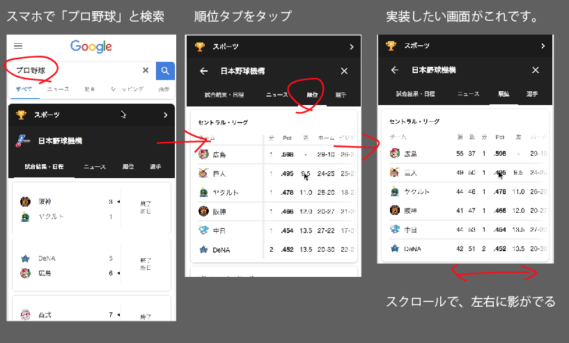
以下のGoogleのテーブルのような、
スクロール後に、影を入れたいのですが、
どういった記述を加えれば良いか教えていただけないでしょうか。
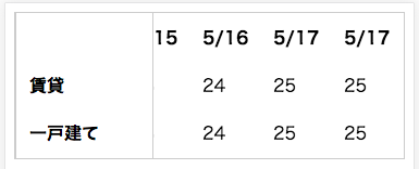
私が作ったテーブルのコードは以下の通りです。
Responsive TablesというJqueryライブラリを使用しています。
ソースには絶対パスを入れています。
※ローカルでは、このHTMLのみで普通に動きます。
※codepenを試したのですが、スクロールバーがおかしくなったので、やめました。
<!DOCTYPE html> <html lang="ja"> <head> <meta charset="UTF-8"> <meta name="viewport" content="width=device-width, initial-scale=1.0"> <meta http-equiv="X-UA-Compatible" content="ie=edge"> <title>テーブル</title> <link type="text/css" media="screen" rel="stylesheet" href="https://zurb.com/playground/projects/responsive-tables/responsive-tables.css" /> <style> div.table-wrapper{ border: 1px solid #ccc; } </style> <script src="https://ajax.googleapis.com/ajax/libs/jquery/2.2.4/jquery.min.js"></script> <script type="text/javascript" src="https://zurb.com/playground/projects/responsive-tables/responsive-tables.js"></script> </head> <body> <table class="responsive"> <thead> <tr> <th class="blank"> </th> <th>5/12</th> <th>5/13</th> <th>5/14</th> <th>5/15</th> <th>5/16</th> <th>5/17</th> <th>5/17</th> </tr> </thead> <tbody> <tr> <th>賃貸</th> <td>12</td> <td>13</td> <td>14</td> <td>23</td> <td>24</td> <td>25</td> <td>25</td> </tr> <tr> <th>一戸建て</th> <td>12</td> <td>13</td> <td>14</td> <td>23</td> <td>24</td> <td>25</td> <td>25</td> </tr> </tbody> </table> </body> </html>
上記のソースで表示される画面は、以下の通りです。
#頂いた回答を元に、修正!
<!DOCTYPE html>
<html lang="ja">
<head>
  <meta charset="UTF-8">
  <meta name="viewport" content="width=device-width, initial-scale=1.0">
  <meta http-equiv="X-UA-Compatible" content="ie=edge">
  <title>テーブル</title>
  <style>
    /* Foundation v2.1.4 http://foundation.zurb.com */
    /* Artfully masterminded by ZURB  */

    /* --------------------------------------------------
       Table of Contents
    -----------------------------------------------------
    :: Shared Styles
    :: Page Name 1
    :: Page Name 2
    */


    /* -----------------------------------------
       Shared Styles
    ----------------------------------------- */

    table th { font-weight: bold; }
    table td, table th { padding: 9px 10px; text-align: left; }

    /* Mobile */
    @media only screen and (max-width: 767px) {

    	table.responsive { margin-bottom: 0; }

    	.pinned { position: absolute; left: 0; top: 0; background: #fff; width: 35%; overflow: hidden; overflow-x: scroll; border-right: 1px solid #ccc; border-left: 1px solid #ccc; }
    	.pinned table { border-right: none; border-left: none; width: 100%; }
    	.pinned table th, .pinned table td { white-space: nowrap; }
    	.pinned td:last-child { border-bottom: 0; }

    	div.table-wrapper { position: relative; margin-bottom: 20px; overflow: hidden; border-right: 1px solid #ccc; }
    	div.table-wrapper div.scrollable { margin-left: 35%; }
    	div.table-wrapper div.scrollable { overflow: scroll; overflow-y: hidden; }

    	table.responsive td, table.responsive th { position: relative; white-space: nowrap; overflow: hidden; }
    	table.responsive th:first-child, table.responsive td:first-child, table.responsive td:first-child, table.responsive.pinned td { display: none; }


    }

    /* responsive-tables.css 以外で追加した CSS */
    div.table-wrapper{
      border: 1px solid #ccc;
    }
    @media print, screen and (max-width: 750px) {
      .table-wrapper .scrollable{
        background: linear-gradient(to left, rgba(255, 255, 255, 0), white 15px) 0 0/50px 100%, linear-gradient(to left, rgba(255, 255, 255, 0), rgba(0, 0, 0, 0.2)) 0 0/20px 100%, linear-gradient(to right, rgba(255, 255, 255, 0), white 15px) right/50px 100%, linear-gradient(to right, rgba(255, 255, 255, 0), rgba(0, 0, 0, 0.2)) right/20px 100%;
        background-repeat: no-repeat;
        background-attachment: local, scroll, local, scroll;
      }
    }
  </style>
</head>
<body>

  <table class="responsive">
    <tr>
      <th>項目1243</th>
      <th>項目1243</th>
      <th>項目1243</th>
      <th>項目1243</th>
      <th>項目1243</th>
      <th>項目1243</th>
      <th>項目1243</th>
      <th>項目1243</th>
    </tr>
    <tr>
      <td>項目</td>
      <td>項目</td>
      <td>項目</td>
      <td>項目</td>
      <td>項目</td>
      <td>項目</td>
      <td>項目</td>
      <td>項目</td>
    </tr>
    <tr>
      <td>項目</td>
      <td>項目</td>
      <td>項目</td>
      <td>項目</td>
      <td>項目</td>
      <td>項目</td>
      <td>項目</td>
      <td>項目</td>
    </tr>
    <tr>
      <td>項目</td>
      <td>項目</td>
      <td>項目</td>
      <td>項目</td>
      <td>項目</td>
      <td>項目</td>
      <td>項目</td>
      <td>項目</td>
    </tr>
    <tr>
      <td>項目</td>
      <td>項目</td>
      <td>項目</td>
      <td>項目</td>
      <td>項目</td>
      <td>項目</td>
      <td>項目</td>
      <td>項目</td>
    </tr>

  </table>


  <script src="https://ajax.googleapis.com/ajax/libs/jquery/2.2.4/jquery.min.js"></script>
  <script type="text/javascript" src="https://zurb.com/playground/projects/responsive-tables/responsive-tables.js"></script>

</body>
</html>
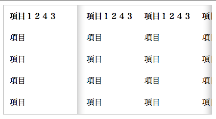
上記のcss記述で実現できました。
アドバイスいただきありがとうございました。
回答1件
あなたの回答
tips
プレビュー
 ベストアンサー


