

 Q&A
Q&A
お問い合わせ内容の前後に<tr>が無かったり、送信するボタンが<table>の外に出ているのが気になるのですが、実際のコードもこのようになっていますか?
投稿2018/08/02 05:26
編集2018/08/02 11:48別ページでも質問した内容なのですが、解決済みにしてしまったため再度質問させてくださいませ。
【HTML/CSS】レスポンシブデザインでのtableの段組み変更について
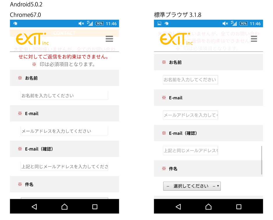
前回、回答いただいた内容で小さい画面の場合、tableの段組みが解除できるようになりました。
このth,td要素にinputなどフォーム部品を入れると、スマホで見た際にサイズが正しく表示されませんでした。
PCでブラウザを小さくすると、input部品はwidth:90%など指定した値になります。
スマホで見た際、幅が50%程度のサイズにしかなりませんでした。
※裏に色を塗ってみたのですが100%のサイズになっていないようです。
width:300pxなど記載すると横幅が正常に伸びるのですが、width:200%など書いても、MAX50%前後のサイズになっているようです。
こちら不具合の原因がどこにありそうかお分かりになりませんでしょうか。
HTML
1~略~ 2 3<meta name="viewport" content="width=device-width, initial-scale=1, minimum-scale=1, maximum-scale=1"> 4 5~略~ 6 7<form id="mailformpro" action="mailformpro/mailformpro.cgi" method="POST"> 8 <table> 9 <tr><th><p class="text-red-inline">※ </p>お名前</th><td><input type="text" name="お名前" required="required" placeholder="お名前を入力してください"></td></tr> 10 <tr><th><p class="text-red-inline">※ </p>E-mail</th><td><input type="email" name="email" required="required" placeholder="メールアドレスを入力してください"></td></tr> 11 <tr><th><p class="text-red-inline">※ </p>E-mail(確認)</th><td><input type="email" name="confirm_email" required="required" placeholder="上記と同じメールアドレスを入力してください"></td></tr> 12 <tr><th><p class="text-red-inline">※ </p>件名</th><td><select name="件名" required="required"> 13 <option value="">-- 選択してください --</option> 14 <option value="test1">test1</option> 15 <option value="test2">test2</option> 16 <option value="test3">test3</option> 17 <option value="その他">その他</option></select></td></tr> 18 19 <tr><th>お問い合わせ内容</th><td><textarea name="お問い合わせ内容" placeholder="お問い合わせ内容を入力してください"></textarea></td></tr> 20 <tr><th colspan="2"><div class="text-center"><button type="submit">送信する</button></th></tr> 21 </table> 22 23</form>
CSS
1@charset "UTF-8"; 2 3/* content */ 4 5.content{ 6 /*margin-top: -550px; 7 padding-top: 550px;*/ 8 margin: auto; 9 text-align: center; 10 max-width: 960px; 11 12 /*background:cyan;*/ 13 /*border: 1px solid black; 14 box-sizing:border-box;*/ 15} 16 17/* cotact */ 18 19.contact{ 20 text-align: center; 21 max-width: 100%; 22 margin-bottom: 30px; 23 margin-bottom: var(--padding-block-height); 24} 25 26.contact table { 27 width: 960px; 28 margin-left: auto; 29 margin-right: auto; 30 margin-bottom: 30px; 31 margin-bottom: var(--padding-block-height); 32 font-size: 14px; 33 font-size: var(--font-size-2); 34} 35 36.contact tr{ 37 /*height: 40px;*/ 38 border-bottom: 1px solid #dedede; 39} 40 41.contact th{ 42 box-sizing:border-box; 43 width: 30%; 44 padding: 15px 20px; 45 font-weight: normal; 46 background: #f2f2f2; 47 vertical-align: middle; 48 /*border-bottom: 1px solid #777777;*/ 49} 50 51.contact td{ 52 box-sizing:border-box; 53 width: auto; 54 color: #777777; 55 vertical-align: middle; 56 padding: 15px 20px; 57} 58 59@media only screen and (max-width:960px){ 60 61 .contact p { 62 padding-left: 5px; 63 padding-right: 5px; 64 } 65 66 .contact table { 67 width: 100%; 68 } 69 70 .contact tr{ 71 display: block; 72 border-bottom: none; 73 } 74 75 .contact th, 76 .contact td { 77 display: block; 78 text-align: left; 79 width: auto; 80 } 81 82 .contact th { 83 font-weight: bold; 84 } 85 86 /* 検証用:塗り 87 .contact th{ 88 background-color: #000; 89 } 90 .contact td{ 91 background-color: #f00; 92 } 93 */ 94 95} 96 97/* form用 */ 98 99.contact input{ 100 width: 90%; 101 height: 33px; 102} 103 104.contact select{ 105 width: 90%; 106 height: 33px; 107 padding-left: 8px; 108} 109 110.contact textarea { 111 width: 90%; 112 resize: none; 113 /*resize: vertical;*/ 114 min-width: 200px; 115 min-height: 200px; 116 max-height: 500px; 117} 118 119.contact button { 120 padding: 15px 40px; 121 font-size: 1.2em; 122 background-color: #000; 123 color: #fff; 124 border-style: none; 125} 126 127@media only screen and (max-width:960px){ 128 .contact input{ 129 /*width: 300px !important;*/ 130 } 131 .contact input, 132 .contact select, 133 .contact textarea{ 134 font-size: 16px; 135 transform: scale(0.9); 136 } 137 138 .contact :placeholder-shown{ 139 font-size: 12px; 140 font-size: var(--font-size-2); 141 } 142} 143
------- 追記 -------
formについてはメールフォームプロというフリーのCGIを使用しております。
CSS / mailformpro.css
回答2件
あなたの回答
tips
プレビュー
 ベストアンサー
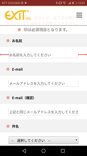


