
 Q&A
Q&A
詳しくは見ていないのですが、デモをそのままでは、同じ症状ですが、googleデベロッパーツール(下側に表示させています)で見ると正常にみえます。高さが関連していそうです。
投稿2018/07/01 00:11
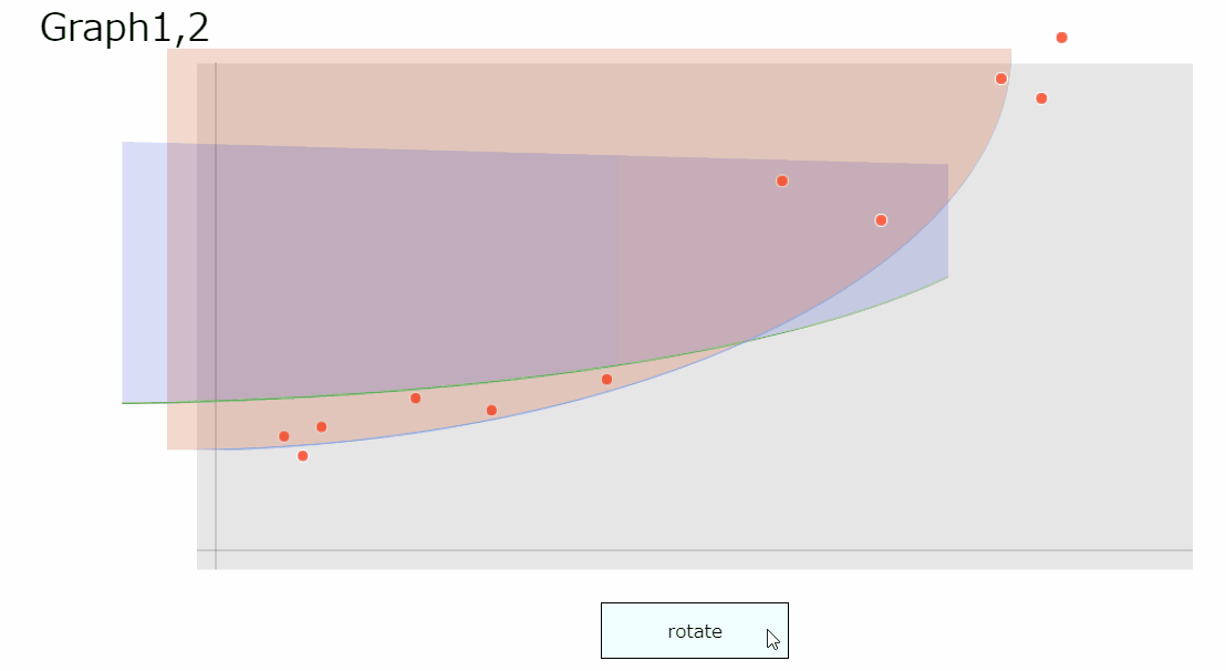
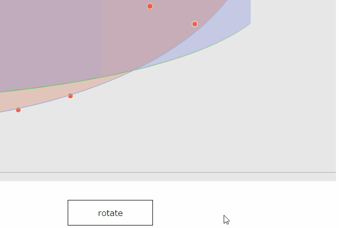
編集2018/07/01 04:04タイトルそのままです.CSSのTransformを利用して要素を3D回転させているのですが,**「見えないはずのものが見える」**というホラーな現象が起きております.
デモ:https://thimbleprojects.org/liveasnotes/511175/
(質問本文中のコードは初期のままですが,デモは最新の状態に更新されています.)
デモの更新箇所には/*modified(add)*/や,/*modified(edit)*/等を書いています
現時点での更新:
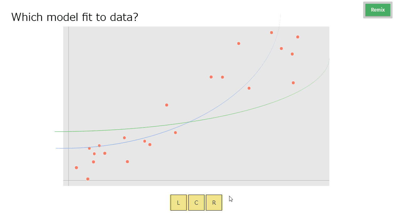
デモは,HTML+CSSで作ったグラフもどきです.発生した問題は3つあり,おそらく似たような原因だろうと睨んでいるのですが,改善方法の検討がつかないので,こちらで質問させていただきます.
発生が確認された環境:Chrome, Firefox
発生が確認された環境:Chrome
発生が確認された環境:Chrome
HTML
1<!DOCTYPE html> 2 3<html lang="ja"> 4 5 <head> 6 <meta charset="utf-8"> 7 <meta name="author" content="liveAsNotes"> 8 <meta name="description" content="this is a demo"> 9 <meta name="format-detection" content="telephone=no, address=no, email=no"> 10 <meta name="viewport" content="width=device-width, initial-scale=1.0"> 11 <meta http-equiv="X-UA-Compatible" content="IE=edge"> 12 <title>demo</title> 13 </head> 14 <body> 15 <input type="checkbox" id="effect"> 16 <h1>Graph1,2</h1> 17 <div id="field"> 18 <div id="axes"></div> 19 <div id="dots"></div> 20 <div id="graph1"></div> 21 <div id="graph2"></div> 22 </div> 23 <label for="effect">rotate</label> 24 </body> 25 26</html>
CSS
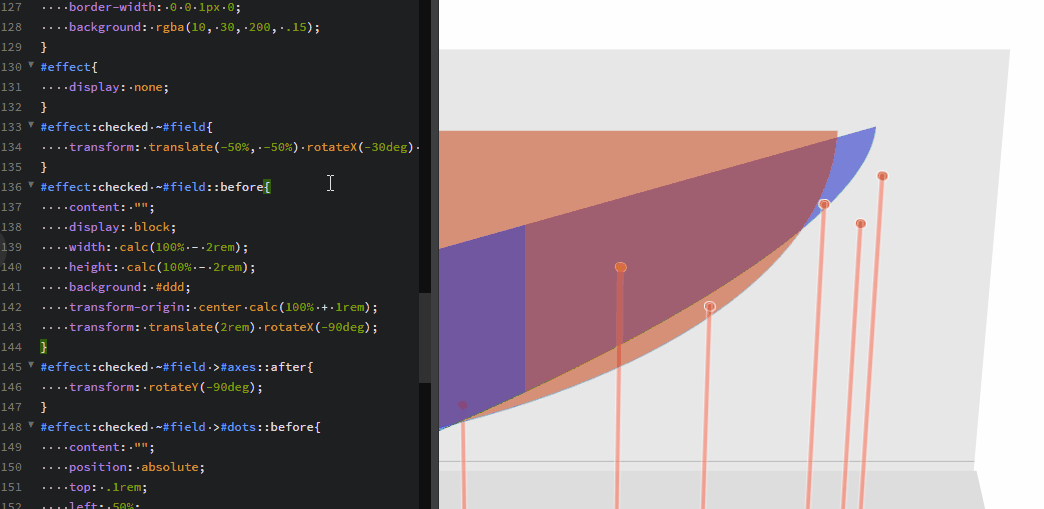
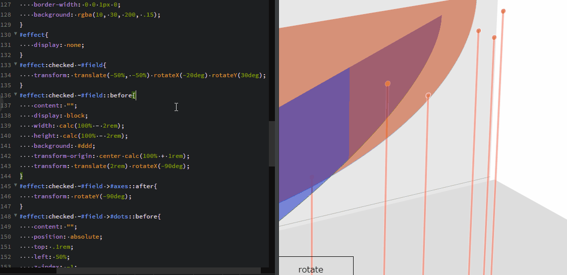
1*, 2*::before, 3*::after{ 4 font-weight: normal; 5 line-height: 1em; 6 padding:0; 7 margin: 0; 8 box-sizing: border-box; 9 -webkit-tap-highlight-color:rgba(0,0,0,.1); 10} 11html,body{ 12 width: 100vw; 13 height: 100vh; 14 overflow-x: hidden; 15} 16html{ 17 font: normal 17px / 17px sans-serif; 18 -webkit-text-size-adjust: 100%; 19} 20body{ 21 position: relative; 22 padding: 3rem; 23 perspective: 3000px; 24} 25h1{ 26 position: absolute; 27 z-index: 1; 28} 29#field{ 30 position: absolute; 31 top: 50vh; 32 left: 50vw; 33 transform-origin: center center; 34 transform-style: preserve-3d; 35 transform: translate(-50%, -50%); 36 transition-duration: .5s; 37 width: 70vw; 38 height: 70vh; 39 background: #e7e7e7; 40} 41#axes, 42#axes::before, 43#axes::after{ 44 position: absolute; 45 bottom: 1rem; 46 width: 70vw; 47 height: 1px; 48 background: #aaa; 49} 50#axes::before, 51#axes::after{ 52 content: ""; 53 bottom: auto; 54 width: 70vh; 55 transform-origin: 1rem center; 56} 57#axes::before{ 58 transform: rotateZ(-90deg); 59} 60#dots{ 61 position: absolute; 62 left: 5rem; 63 bottom: 7rem; 64 width: .5rem; 65 height: .5rem; 66 transform-origin: left top; 67 transform: translateZ(5rem) rotateY(-10deg); 68 border-radius: 100%; 69 background: tomato; 70 box-shadow: 71 0 0 0 1px #fff, 72 1rem 1rem tomato, 73 1rem 1rem 0 1px #fff, 74 2rem -.5rem tomato, 75 2rem -.5rem 0 1px #fff, 76 7rem -2rem tomato, 77 7rem -2rem 0 1px #fff, 78 11rem -1.4rem tomato, 79 11rem -1.4rem 0 1px #fff, 80 17rem -3rem tomato, 81 17rem -3rem 0 1px #fff, 82 26rem -13rem tomato, 83 26rem -13rem 0 1px #fff, 84 31rem -11rem tomato, 85 31rem -11rem 0 1px #fff, 86 37rem -18rem tomato, 87 37rem -18rem 0 1px #fff, 88 39rem -17rem tomato, 89 39rem -17rem 0 1px #fff, 90 40rem -20rem tomato, 91 40rem -20rem 0 1px #fff; 92} 93#graph1{ 94 position: absolute; 95 top: 0; 96 left: 0; 97 width: 80%; 98 height: 75%; 99 transform: translateZ(10rem); 100 border: 3px solid cornflowerblue; 101 border-radius: 0 0 100%; 102 border-width: 0 0 1px 0; 103 background: rgba(200, 60, 10, .2); 104} 105#graph2{ 106 position: absolute; 107 top: 20%; 108 transform-origin: left top; 109 transform: translateZ(60vh) rotateX(-0deg) rotateY(30deg); 110 width: 100%; 111 height: 45%; 112 border: 3px solid limegreen; 113 border-radius: 0 0 100%; 114 border-width: 0 0 1px 0; 115 background: rgba(10, 30, 200, .15); 116} 117#effect{ 118 display: none; 119} 120#effect:checked ~#field{ 121 transform: translate(-50%, -50%) rotateX(-20deg) rotateY(-30deg); 122} 123#effect:checked ~#field::before{ 124 content: ""; 125 display: block; 126 width: calc(100% - 2rem); 127 height: calc(100% - 2rem); 128 background: #ddd; 129 transform-origin: center calc(100% + 1rem); 130 transform: translate(2rem) rotateX(-90deg); 131} 132#effect:checked ~#field >#axes::after{ 133 transform: rotateY(-90deg); 134} 135#effect:checked ~#field >#dots::before{ 136 content: ""; 137 position: absolute; 138 top: .1rem; 139 left: 50%; 140 z-index: -1; 141 transform: translate(-50%); 142 display: block; 143 width: .2rem; 144 height: 100vh; 145 background: tomato; 146 box-shadow: 147 0 0 0 1px #fff, 148 1rem 1rem tomato, 149 1rem 1rem 0 1px #fff, 150 2rem -.5rem tomato, 151 2rem -.5rem 0 1px #fff, 152 7rem -2rem tomato, 153 7rem -2rem 0 1px #fff, 154 11rem -1.4rem tomato, 155 11rem -1.4rem 0 1px #fff, 156 17rem -3rem tomato, 157 17rem -3rem 0 1px #fff, 158 26rem -13rem tomato, 159 26rem -13rem 0 1px #fff, 160 31rem -11rem tomato, 161 31rem -11rem 0 1px #fff, 162 37rem -18rem tomato, 163 37rem -18rem 0 1px #fff, 164 39rem -17rem tomato, 165 39rem -17rem 0 1px #fff, 166 40rem -20rem tomato, 167 40rem -20rem 0 1px #fff; 168 border-radius: .1rem; 169 opacity: .5; 170} 171#effect:checked ~#field >#graph1{ 172 background: rgba(200, 60, 10, .5); 173} 174#effect:checked ~#field >#graph2{ 175 background: rgba(10, 30, 200, .5); 176} 177label[for="effect"]{ 178 position: absolute; 179 left: 50vw; 180 bottom: 1rem; 181 transform: translateX(-50%); 182 width: 10rem; 183 height: 3rem; 184 font-size: 1rem; 185 text-align: center; 186 border: 1px solid; 187 padding: 1rem; 188 transition-duration: .5s; 189} 190label[for="effect"]:hover{ 191 background: azure; 192}
※本文中のGifは,以下のセレクタのrotateXおよびrotateYプロパティを弄っています
CSS
1#effect:checked ~#field{ 2 transform: translate(-50%, -50%) rotateX(-20deg) rotateY(-30deg); 3}
もしブラウザによって見え方・挙動が異なる場合は,その旨教えていただけると参考になります(ブラウザハック的なことが必要になるかもしれないので...)
横幅に応じて,要素の前後関係が修正されるとのこと-->検証中
回答1件
あなたの回答
tips
プレビュー
 自己解決
自己解決